### Exploring the Visual Power of Sunburst Charts: Enhancing Data Interpretation and Presentation
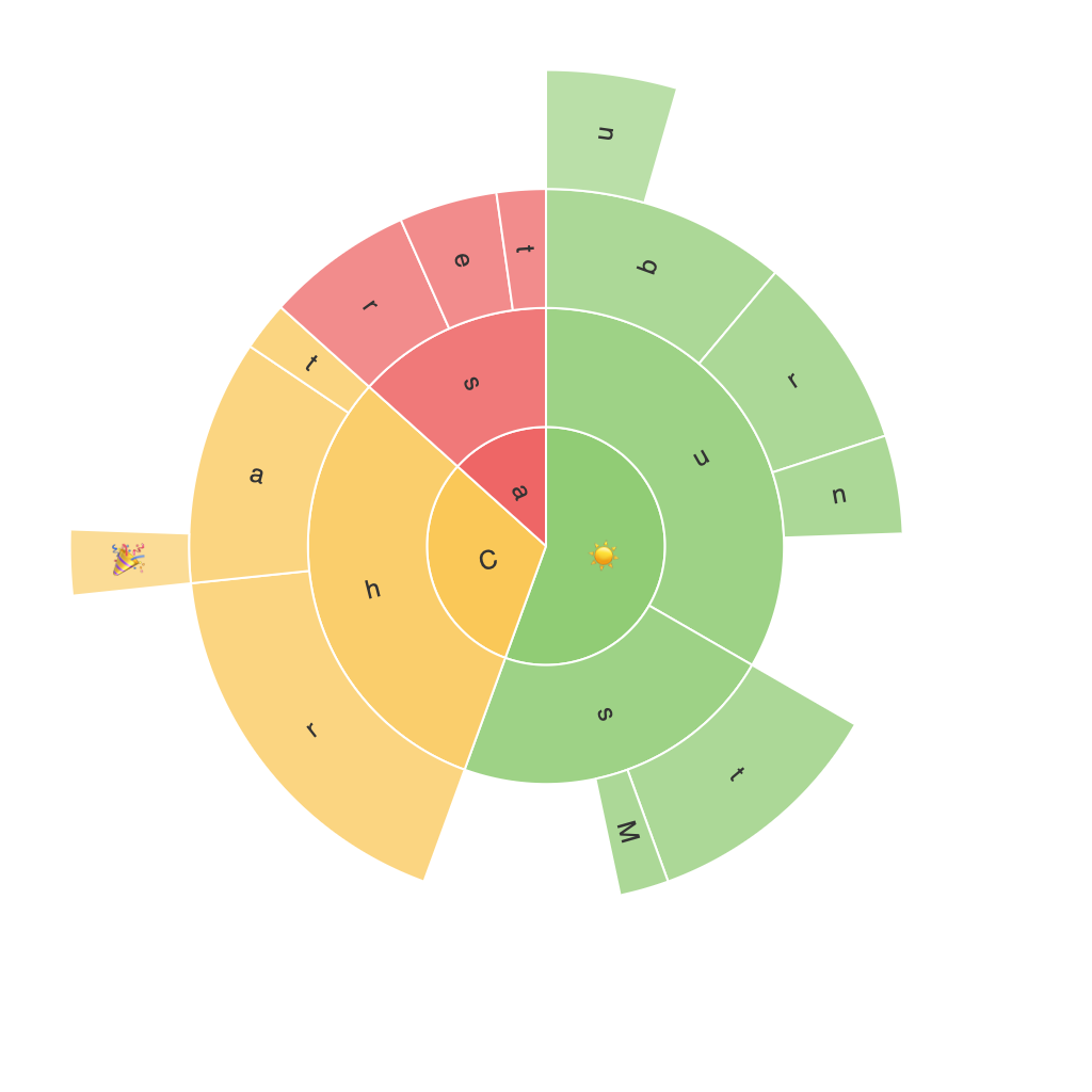
In the landscape of data visualization, Sunburst Charts stand out as a powerful tool for representing hierarchical data. These charts harness the visual strength of concentric circles and multi-level radial slices, providing an efficient way to understand complex datasets quickly and intuitively. Let’s delve into the anatomy of Sunburst Charts, their unique features, and the methods by which they enhance data interpretation and presentation.
#### What Are Sunburst Charts?
Sunburst Charts, also known as Ring Charts or Radial Treemaps, serve to visualize hierarchical data in a compact, intuitive format. Unlike traditional tree diagrams or stacked area charts, they represent each level of the hierarchy as a ring in a circle, with the innermost ring displaying the highest level and the outer rings breaking down into sub-categories and so on.
#### Key Concepts and Components
**Radii:** Each radius in a Sunburst Chart represents a level of the hierarchy, with the most significant categories forming the innermost circle and increasingly smaller circles representing more specific subcategories.
**Slices:** Each slice of the rings is colored differently to represent a specific category within the hierarchy. The size of the slice typically corresponds to the value or weight of that category, though this can be customized.
**Hierarchical Nesting:** By breaking down data into multiple concentric levels, Sunburst Charts can beautifully represent complex structures. This level of detail makes it easy to compare sizes and proportions across different levels of the hierarchy.
#### Advantages of Sunburst Charts
**Accessibility:** Because of the visual simplicity and intuitive layout, Sunburst Charts are universally accessible. They can immediately convey the relative sizes of categories and their relationships within the hierarchical structure, making even complex data easy to grasp.
**Space Efficiency:** Given their compact, circular layout, Sunburst Charts are optimized for use in space-constrained environments or for visualizing large datasets on small screens. They minimize the amount of screen real estate needed for a comprehensive view.
**Comparison and Exploration:** The nested structure of Sunburst Charts is particularly advantageous for the detailed exploration and comparison of data. It allows users to drill down into specific areas and understand the contributions of smaller categories to the overall dataset.
#### Example Use Cases
– **Sales and Marketing**: Sunburst Charts can be used to show the breakdown of sales across different products and territories, providing a visual summary of which products are performing best in each region and whether sales are concentrated or spread out.
– **E-commerce**: They can illustrate the categories within product categories, aiding in the optimization of product placement and promotional strategies.
– **Organizational Structure Visualization**: In the context of corporate structures, a Sunburst Chart can depict the division of tasks or responsibilities between executives or departments, providing a clear visual representation of the organizational hierarchy and its dynamics.
#### Conclusion
With their ability to encapsulate hierarchical data in a visually accessible and space-efficient manner, Sunburst Charts offer a compelling solution for enhancing data interpretation and presentation. Whether in the context of product analysis, corporate strategy, or general data exploration, these charts prove to be a powerful tool for revealing insights and facilitating informed decision-making. By leveraging the unique visual strength of Sunburst Charts, organizations and data analysts can achieve clearer, more engaging, and more efficient communication of complex datasets.
