Exploring the Visual Brilliance of Sunburst Charts: A Comprehensive Guide to Enhancing Data Interpretation
In the rich tapestry of data visualization tools, sunburst charts offer a visually stunning way to represent hierarchical data, blending elegance and sophistication with a unique approach to data interpretation. This article delves deep into the magic of sunburst charts, providing insights, applications, and practical tips on how they can enhance the way we comprehend complex data structures.
### Understanding Sunburst Charts
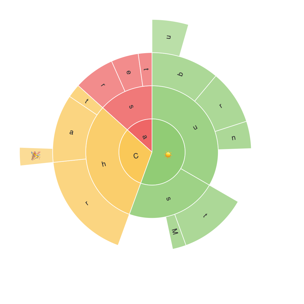
Sunburst charts, also known as radial treemaps or multi-level sun charts, are circular visualizations that represent hierarchical data structured in concentric rings. Each ring represents a level in the hierarchy, and the size of each segment, or sector, reflects the value it represents. Unlike traditional pie charts, which suffer limitations in distinguishing small slices, sunburst charts are particularly adept at handling data with multiple categories and subcategories, making them an invaluable tool for revealing underlying patterns and relationships within large datasets.
### Key Characteristics and Benefits
**Hierarchical Clarity**: Sunburst charts excel in visually highlighting the hierarchical structure of data. Each level is displayed in a ring outward from the center, making it easy to see how components relate to the whole and to each other.
**Comparison of Categories**: The relative sizes of sectors within rings allow for intuitive comparison between categories and subcategories, offering a clear visual cue to the magnitude of values.
**Space Efficiency**: Due to their circular layout and nested structure, sunburst charts can efficiently display a large amount of information, including multiple layers of subcategories, without overcrowding the visual space.
### Creating Effective Sunburst Charts
**1. Data Structure**: Before creating a sunburst chart, ensure your data is structured hierarchically. The primary category or root node goes at the center, and more detailed categories are added as sub-rings.
**2. Segmentation**: Decide on how many segments to include based on the data’s complexity. Too many can lead to clutter, while too few may simplify the visualization excessively.
**3. Color Coding**: Assign distinct colors to each segment to differentiate categories easily. Consider the color palette carefully to ensure accessibility and readability, especially for those with color vision deficiencies.
**4. Legends and Labels**: While sunburst charts emphasize visual representation, incorporating a legend for categorical representation or labels at the segment boundary can aid in quick understanding and interpretation.
### Practical Applications
Sunburst charts find applications across a wide array of industries and fields:
– **Business Intelligence**: For analyzing company structures, product hierarchies, or market segments where hierarchical data is crucial.
– **Healthcare**: In visualizing patient data with respect to different diagnoses, treatments, or outcomes.
– **Web Analytics**: Depicting navigation patterns across website sections, user journey insights, and more.
– **Education**: Visualizing classroom grades, student performance across subjects, or academic curriculum structure.
### Best Practices
– **Limit Depth and Width**: Keep the chart reasonably deep (around 5 to 6 levels) to maintain clarity and avoid clutter.
– **Use Hover Effects**: Implement hover-over effects for sub-segments to provide additional information while avoiding the visual noise on the chart itself.
– **Interactive Elements**: For complex datasets, incorporate interactive elements like clickable segments or animations to enhance user engagement and data exploration.
### Conclusion
Sunburst charts are an artist’s canvas for data visualization, promising a visually captivating and informative representation of hierarchical structures. Through their unique circular layout and the nuanced portrayal of data relationships, these charts offer a powerful tool for unlocking insights from complex datasets. Whether used in a business setting for analyzing organizational hierarchies or in educational contexts for breaking down knowledge structures, the potential applications highlight the versatility and utility of sunburst charts in enhancing data interpretation.
