Exploring the Visual Power of Sunburst Charts: A Guide to Enhancing Data Interpretation and Presentation
Sunburst charts, a unique form of hierarchical data visualization, are gaining popularity across the board, from data analytics to dashboards, and beyond. These visually appealing charts offer a rich and insightful means to present complex hierarchical data in an easily comprehensible format. This guide aims to unravel the potential of sunburst charts and how they can significantly enhance data interpretation and presentation.
### Understanding Sunburst Charts
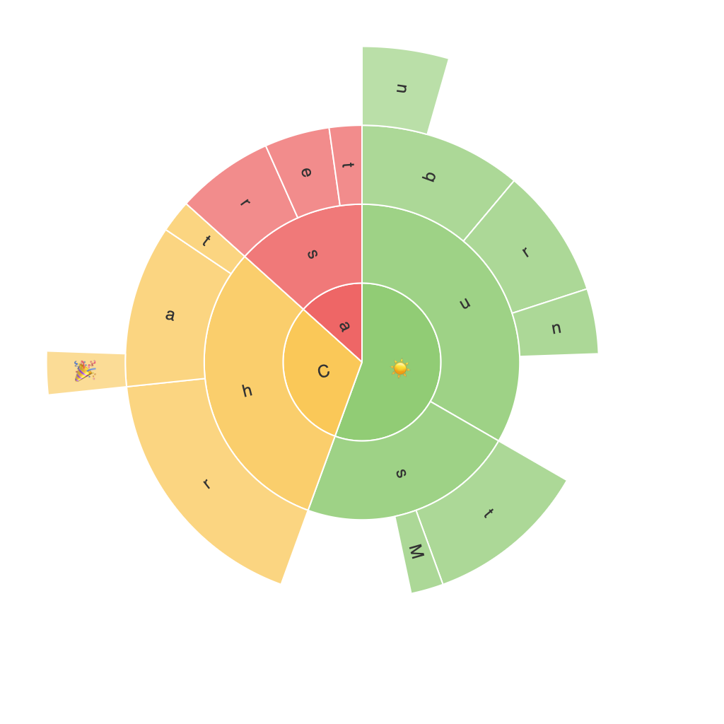
Sunburst charts, akin to pie charts, are circular diagrams with concentric rings or segments to represent the hierarchical structure of data. The chart’s center usually denotes the root node, and with radiating rings, it extends out to depict various levels of data. Each ring corresponds to a hierarchical level, and segments within these rings represent individual members.
### Key Components of Sunburst Charts
– **Root Node**: The centermost segment represents the top level of hierarchy.
– **Hierarchical Levels**: The rings expanding outward from the root illustrate subsequent layers, enabling a clear visualization of the hierarchical structure.
– **Segments**: Each segment within a ring represents an element within that hierarchy level, facilitating the understanding of composition and proportions.
– **Linkages**: Lines or colors can connect segments to visually demonstrate relationships and hierarchy levels.
### Enhancing Data Interpretation
Sunburst charts excel in visualizing hierarchical relationships, making it easier to discern patterns and structures within the data. The visual density of the chart allows users to grasp the proportion of different categories, making it particularly useful for datasets with a large degree of hierarchy. For example, in financial analysis, a sunburst chart can effectively show revenue contribution by department and product category, enabling stakeholders to quickly identify major contributors.
### Enhancing Presentation
Sunburst charts are not only informative but also dynamic. Their aesthetic appeal can make the presentation of data more engaging and memorable to audiences. This makes them particularly valuable for stakeholders, clients, or any audience that requires a straightforward yet compelling view of hierarchical data. Their clean design also reduces visual clutter, making the information easier to process, which is advantageous for presentations in numerous formats, from traditional office settings to digital web-based dashboards.
### Practical Applications
Sunburst charts are used in a variety of practical scenarios:
– **Project Management**: Showing the breakdown of resources or tasks by department or project levels.
– **Market Analysis**: Breaking down market segments by regions, product categories, or customer segments.
– **Organizational Structure**: Displaying a company’s hierarchy, showing the composition of departments, teams, or employees.
– **Budgeting**: Showing budget allocations across different departments, divisions, or programs.
### Choosing the Right Data
To best utilize a sunburst chart, ensure your data has a clear hierarchical structure with adequate depth to be visually meaningful. For instance, for organizational structures, there should be at least three levels, and ideally, more levels where there are distinct subgroups.
### Best Practices
– **Limit Hierarchical Levels**: While powerful, excessive levels can make the chart overly complex and less usable.
– **Use Colors Wisely**: Employ colors to differentiate and emphasize specific segments without overwhelming the chart.
– **Label Wisely**: While minimizing visual clutter, ensure key segments are labeled for clarity unless the context is universally understood.
– **Interactive Elements**: Where possible, adding interactive capabilities like tooltips when hovering over segments can significantly enhance user engagement and provide more detailed insights.
### Conclusion
Sunburst charts are a robust tool for presenting hierarchical data, providing clear insights into complex structures, and enhancing communication in various professional settings. By effectively visualizing data through these charts, users can more easily interpret large datasets, streamline decision-making processes, and captivate diverse audiences. Embracing the unique visual power of sunburst charts opens vast possibilities for more insightful and engaging data presentation and interpretation.
