Unlocking Insights with Sunburst Charts: A Comprehensive Guide to Visualization and Data Exploration
Sunburst charts are a specialized type of visualization tool that provides an intuitive way to represent hierarchical data. Unveiling the complex layers of data, they serve as a valuable exploration aid in comprehending relationships, patterns, and trends within a dataset. This guide aims to delve into the world of sunburst charts, explaining their construction, applications, and how to effectively utilize them for data analysis and visualization.
### Constructing a Sunburst Chart
**Step 1: Hierarchical Data**
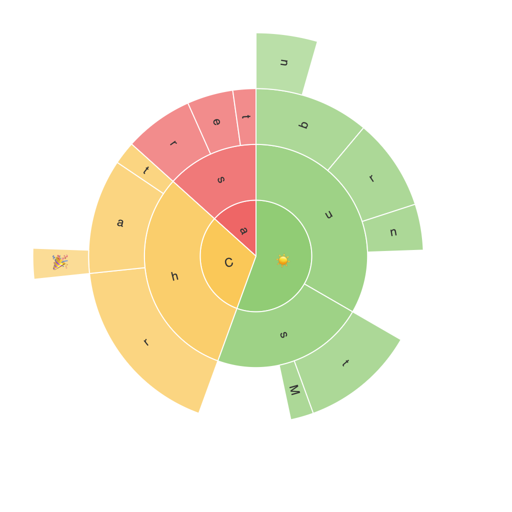
The foundation of a sunburst chart lies in its ability to visualize hierarchical data. Each level in the hierarchy is represented as concentric rings, or sectors. The outermost ring represents the top-level categories, while each subsequent ring within delves into the subcategories beneath.
**Step 2: Color Coding**
Each sector is color-coded to distinguish different categories and subcategories. This coloring system not only enhances the visual aesthetic but also aids in quickly identifying and comparing different segments.
**Step 3: Sizes and Slices**
The size of each slice within a ring generally reflects the value associated with the corresponding data. Larger slices indicate a greater value, allowing viewers to grasp at a glance which categories carry more weight in the overall dataset.
### Applications of Sunburst Charts
1. **Organizational Structure**
Sunburst charts are particularly useful in visualizing organizational structures, where each level could represent different facets or departments, providing a clear overview of the relationships and hierarchy within the organization.
2. **Website Navigation**
They can depict website navigation paths, showing how users move through various sections of a website. This helps web designers understand user paths and optimize navigation interfaces.
3. **Product Line Analysis**
Businesses often use sunburst charts to organize and display the components of a product line, detailing different categories of products and how they contribute to overall sales or revenue.
4. **Segmentation Analysis**
In market research or demographic studies, sunburst charts can represent different segments of data, such as age groups or geographic regions, allowing for a quick comparison of various segments’ contributions.
### Effective Use in Data Exploration
**1. Drill-Down**
Sunburst charts allow for drill-down analysis, enabling users to explore a data hierarchy in detail by hovering over or interacting with specific sectors. This interactive feature deepens understanding by revealing the inner workings of the data.
**2. Highlighting**
For pinpointing specific categories or subcategories, tools like highlighting sectors in different colors or sizes can be used to draw the viewer’s attention to particular data points.
**3. Comparative Analysis**
By comparing the sizes or values of different sectors, comparative analysis becomes easier, assisting in identifying trends, similarities, and differences within the dataset.
### Conclusion
Sunburst charts are a powerful tool for data visualization, especially when dealing with hierarchical data. They provide a clear, visual overview and facilitate easy exploration and analysis. By understanding how to construct and effectively use sunburst charts, analysts and data enthusiasts can unlock deeper insights into complex datasets, making them a valuable asset in the realm of data-driven decision-making.
