Exploring the Visual Power of Sunburst Charts: A Comprehensive Guide to Data Presentation and Interpretation
Sunburst charts are a highly effective data visualization tool used to represent hierarchical data in a structured manner. With their visually appealing layout and ability to handle a substantial amount of data, sunburst charts have become an increasingly popular choice for representing complex data sets in a comprehensible way. This article aims to explore the visual power of sunburst charts, explaining their design, their applications, and detailing the step-by-step process of creating and interpreting such charts.
### Understanding the Structure of a Sunburst Chart
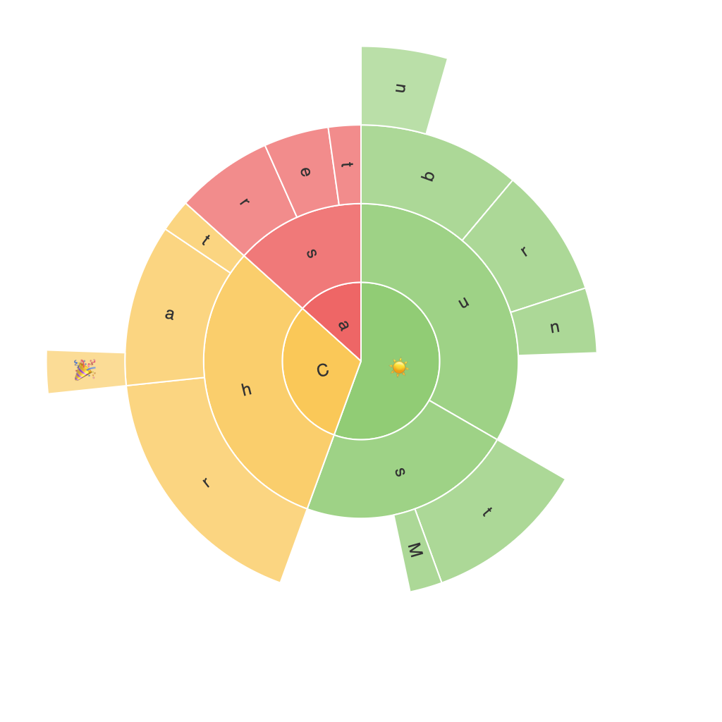
At the heart of a sunburst chart is a circular layout, resembling a pie chart but expanded to accommodate more complexity. The central circle represents the root node of the data hierarchy, and the radial divisions originating from this point symbolize the parent-child relationships within the data. As the divisions radiate outward, they split into additional segments, each representing a child node. This hierarchical nesting continues outwards, providing a clear view of the data’s depth and structure.
### Examples of Data Best Represented by Sunburst Charts
**E-commerce Products**: Sunburst charts can effectively illustrate the sales breakdown of a product line, with the outermost circle representing product categories, the next layer highlighting subcategories, and leaf nodes displaying the specific products within those subcategories.
**Website Navigation**: They can visually depict navigation paths on a website, with each level deepening into more granular sections, clearly showing which parts of the site are most traversed.
**Organizational Structure**: For businesses, a sunburst chart might represent the company structure, with the root being the main division, its branches the sub-divisions, and the leaf nodes the individual employees.
### Advantages of Sunburst Charts
**Clarity and Hierarchy**: Sunburst charts are designed to make complex hierarchical data easily understood by providing a clear visual representation of the data’s structure.
**Relationships and Proportions**: The layout of the chart offers a straightforward way to visualize both the proportion of each level in the hierarchy and the relationships between parent and child nodes.
**Space Efficiency**: Compared to traditional tree maps or stacked bar charts, sunburst charts utilize more of the space by taking advantage of the circular layout, making efficient use of screen space.
### How to Create a Sunburst Chart
1. **Data Preparation**: Convert your hierarchical data into a format suitable for a sunburst chart. This usually involves creating a JSON, XML, or a structured database table that contains a node ID, parent node ID, and the label for each node.
2. **Chart Creation Software**: Use data visualization tools like Tableau, Power BI, Google Charts, or Python libraries such as Plotly or Matplotlib to create your sunburst chart.
3. **Label Nodes**: Ensure that all nodes are identified and that their hierarchy is correctly mapped. This involves assigning data to root, parent, and child nodes based on your data structure.
4. **Color Coding**: Utilize color to help distinguish between different levels of the hierarchy, categories, and data sets. This enhances the perception of proportions and relationships within the chart.
5. **Annotate**: Add annotations to highlight key data points or trends. This can be particularly useful when there are numerous segments and it’s critical to draw attention to specific areas.
6. **Interactivity**: If the tool supports it, implement interactivity features such as hover-over actions that show more detailed information about a particular node upon selection. This enhances the user experience and helps in deep exploration of data.
### Tips for Effective Interpretation
1. **Focus on Key Segments**: Concentrate on the most significant segments to avoid overwhelming the viewer with too much detail. This helps in communicating the most relevant information effectively.
2. **Use Consistent Formatting**: Applying consistent formatting across labels, colors, and other elements helps in maintaining clarity and coherence within the chart.
3. **Narrative Context**: Provide a clear narrative that guides the user through the chart, explaining the purpose and context of the data, making it easier to understand and interpret.
4. **Iterative Design**: Continuously refine and test the chart with different audiences. This can reveal additional ways to improve the visualization, such as reorganizing nodes or adding more visual elements to enhance understanding.
### Conclusion
Incorporating sunburst charts in data presentation offers a new dimension of visual storytelling. By exploring their design, applications, and creation process, it becomes apparent that they are not just visual tools but effective communication devices tailored for representing hierarchical data in a clear, engaging, and comprehensive manner. Whether it’s enhancing business intelligence, guiding user navigation on websites, or exploring organizational structures, sunburst charts provide a powerful means to make complex data sets intelligible, insightful, and accessible to a broader audience.
