Unraveling the Complexity with Sunburst Charts: A Comprehensive Guide to Visualizing Hierarchical Data
Sunburst charts are a type of visualization that display hierarchical data in a radial layout. These charts have increasingly gained popularity due to their ability to represent complex, multilevel information in a comprehensible, aesthetically pleasing manner. If you’ve used charts like treemaps or pie charts before, you’re on your way to understanding this complex yet fascinating data visualization technique.
### What Makes Sunburst Charts Unique?
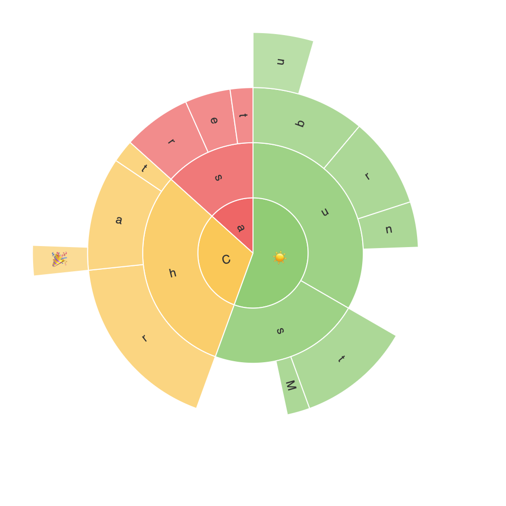
Sunburst charts display hierarchical data through concentric circles, with each circle split into segments. These segments represent various levels of data, and the relative size of each segment indicates its level of importance. This design allows viewers to easily distinguish between levels of hierarchy and comprehend the relationships between different segments.
### Key Components of a Sunburst Chart
– **Root Node**: The root node is typically at the center of the chart and represents the top-level category in your data hierarchy.
– **Levels**: Each level is a layer of the sunburst chart, radiating outward. These are typically smaller circles that emerge from the previous level.
– **Segments**: Each segment within a circle represents a data item from the specified category at the corresponding level in the hierarchy. The segment size is proportional to the value it represents.
### Advantages of Sunburst Charts
#### Clarity in Hierarchy
Sunburst charts provide an immediate visual understanding of the hierarchical structure, making it easy to trace parent-child relationships.
#### Insights at a Glance
Thanks to their circular layout, these charts can quickly show the relative contribution of each level to the whole structure, aiding in identifying key areas at any particular level.
#### Customizability
Sunburst charts allow for customization of various elements, including colors, label options, and segment values, providing great flexibility in presenting data according to specific needs.
### Effective Use of Sunburst Charts
1. **Choose the Right Data Structure**: Sunburst charts work well with data that has a natural hierarchical structure, such as categories, subcategories, and sub-subcategories. Ensure that the hierarchy is clear and logical.
2. **Keep Complexity in Check**: While the radial layout can handle multiple hierarchical levels, large datasets can clutter the chart. Optimize the chart by reducing unnecessary details and focusing on the most relevant data.
3. **Utilize Tooltips for Detailed Information**: To accommodate detailed segment information without overcrowding the chart, implement tooltips that display additional data when hovering over or tapping on segments.
4. **Highlight Important Data**: Emphasize key data points with colors, sizes, or by placing them in strategically important positions on the chart.
### Implementing Sunburst Charts
Sunburst charts are widely supported across visualization tools and platforms such as Tableau, Microsoft Power BI, and Python libraries like plotly and matplotlib. Make sure to leverage the specific capabilities of your preferred tool to customize the look and feel of your sunburst charts.
In summary, sunburst charts are a powerful tool for visualizing complex hierarchical data. Their unique layout offers advantages like clear hierarchy representation and quick insights, making them a valuable addition to your data visualization toolkit. With careful planning and appropriate data selection, you can create informative, engaging, and visually stunning sunburst charts that effectively communicate your message to stakeholders.
