**Exploring the Visual Brilliance of Sunburst Charts: A Comprehensive Guide to Data Visualization**
In the vast ocean of data visualization, one chart stands out for its ability to convey complex hierarchical information in an elegant and clear manner: the sunburst chart. These charts, with their visually stunning design, are not only pleasing to the eye but also incredibly efficient in breaking down data into easily digestible parts, offering a unique perspective on hierarchical structures. This comprehensive guide aims to enlighten you about the intricacies of sunburst chart design, their various applications, and how to use them most effectively for data storytelling.
### Understanding Sunburst Charts
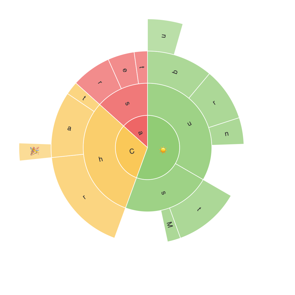
Sunburst charts, a type of circular chart, visually represent hierarchical data, showing the relationship between part and whole. The central circle is typically split into sectors representing individual components, each of which can be further divided into smaller sectors, representing sub-structures and sub-components. This structure allows for the layering of up to three levels of data, making it an excellent tool for visualizing data with a treemap-like structure.
### Design Elements
**Radiant Sectors:** The most fundamental element, each sector represents a category with a specific proportion to the whole, making it easy to compare sizes visually. The color and size of each sector can encode additional data dimensions, such as value or importance.
**Hierarchical Pathways:** A unique aspect is the use of radial and angular sectors that branch out from the center, allowing for the representation of multiple hierarchical levels. The path a sector takes through the levels helps in understanding the category’s place in the overall structure.
**Accessibility and Clarity:** Effective design requires careful consideration to maintain clarity, even when the chart gets complex with additional levels. Avoid clutter and ensure that the labels are readable and do not overlap.
### Tools and Platforms
Sunburst charts are supported by several data visualization tools and software, including:
– **Tableau:** Power users can explore and visualize data using Tableau’s extensive library of chart types, including the versatile Sunburst chart.
– **PowerBI:** Microsoft’s analytics service offers a rich feature set for creating dynamic visualizations, including supporting sunburst charts.
– **D3.js:** JavaScript library for producing interactive data visualizations in web browsers.
– **Matplotlib:** In Python, the popular visualization library supports the creation of sunburst charts using its hierarchical plotting capabilities.
### Applications
1. **Organizational Structure:** Visualizing the organizational hierarchy helps in understanding the flow of management and employee roles.
2. **File System Structure:** In web design or computer science, sunburst charts can illustrate the different types of files and directories within a system.
3. **Product Categories:** Brands can leverage sunburst charts to show the sales distribution across different product categories, highlighting the most popular segments.
### Tips for Effective Use
– **Focus on the Target Audience:** Tailor the level of detail to the audience’s familiarity with the hierarchy. Simplify for those who are less familiar and provide additional context for those who are deeply involved.
– **Use Color Wisely:** Employ color schemes to highlight key elements or trends. Be sure to maintain color consistency for related categories to ensure clarity and readability.
– **Limit Depth:** While sunburst charts can display data across multiple levels, excessive depth can overwhelm the viewer. Limiting the chart to three levels is recommended for the best visual impact and understanding.
### Conclusion
The beauty and power of sunburst charts lie in their simplicity and effectiveness for visualizing hierarchical data. Whether analyzing complex organizational structures, exploring the depth of file systems, or dissecting product categories, these charts offer a unique and intuitive way to communicate information. By mastering their use, you can enhance your data storytelling skills, making complicated data accessible and engaging for everyone involved.
