Exploring the Power of Sunburst Charts: A Visual Guide to Enhancing Data Interpretation and Presentation
When it comes to visualizing hierarchical data, many professionals and data scientists turn to traditional charts like pie charts or treemaps. However, there’s a lesser-known chart type that’s catching the attention of data enthusiasts: the Sunburst Chart. These charts offer a unique and effective way to visualize large amounts of hierarchical data, enhancing both data interpretation and presentation. In this article, we’ll take an in-depth look at the Sunburst Chart, its features, advantages, and how to create engaging and insightful visualizations using the Sunburst chart.
### What is a Sunburst Chart?
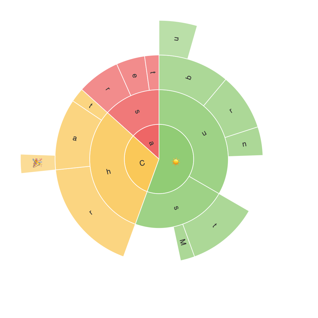
A Sunburst Chart, also known as a Radar or Kiviat chart, is a circular tree chart that displays hierarchical data using ring sectors. Each ring represents a level in the hierarchy, with the outer rings showing higher levels. The depth and segments within each ring allow for the depiction of multiple levels of nesting in a clear, visually appealing manner.
### Enhancing Data Interpretation
1. **Simplifying Complex Hierarchies**: Sunburst charts excel at making complex hierarchical data easily comprehensible. The structure allows users to quickly grasp the relationships within the data by following the spokes from the center outward.
2. **Comparison Facilitation**: When using multiple data perspectives, the ring sectors enable a side-by-side comparison, highlighting overlaps and differences in data at various levels.
### Data Presentation Improvement
1. **Improved Clarity and Accessibility**: With its concentric rings and straightforward layout, the Sunburst Chart presents data in a visually engaging way. This design can make even complicated data sets more accessible to a general audience.
2. **Better Use of Space**: By organizing data hierarchically, the Sunburst chart avoids clutter and helps direct the viewer’s attention to the most relevant segments by placing them closest to the center.
### Creating Sunburst Charts
1. **Software Utilization**: Use data visualization software like Tableau, Power BI, or Python libraries such as Plotly and Seaborn to create Sunburst Charts. Each tool offers specific functions and options for customizing the chart’s appearance and enhancing interactivity.
2. **Data Preparation**: Prior to creating the chart, ensure your data is well-structured. It should include a hierarchy column (e.g., a title and sub-title) for clear segmentation, and measure columns (e.g., values for each segment).
3. **Customization and Analysis**: Customize the color scheme, labels, and tooltips to enhance readability and provide analytical insights at a glance. Interactivity features like hover effects or drill-down capabilities can further aid in data exploration.
### Conclusion
The Sunburst Chart stands as a powerful tool in data visualization, offering a fresh approach to presenting hierarchical data structures. By simplifying complex data into easily understandable visual representations, Sunburst Charts enhance both the interpretability and engagement with data, making it a valuable asset in any professional’s data reporting arsenal. Whether you’re working on a business report, academic research, or personal projects, this chart type guarantees a memorable and informative presentation of your data.
