Exploring the Power of Visual Representation – Sunburst Charts
In the labyrinth of data analysis, various tools serve different purposes. From numerical algorithms to graphs and charts, these visual tools aim to simplify complex data, making it easier to identify patterns, trends, and anomalies. One such tool is the Sunburst Chart, a form of data visualization that offers a unique way to layer data into distinct segments, providing a clear insight into hierarchical relationships. This article seeks to guide you through the understanding, implementation, and interpretation of this insightful chart.
### Understanding Sunburst Charts
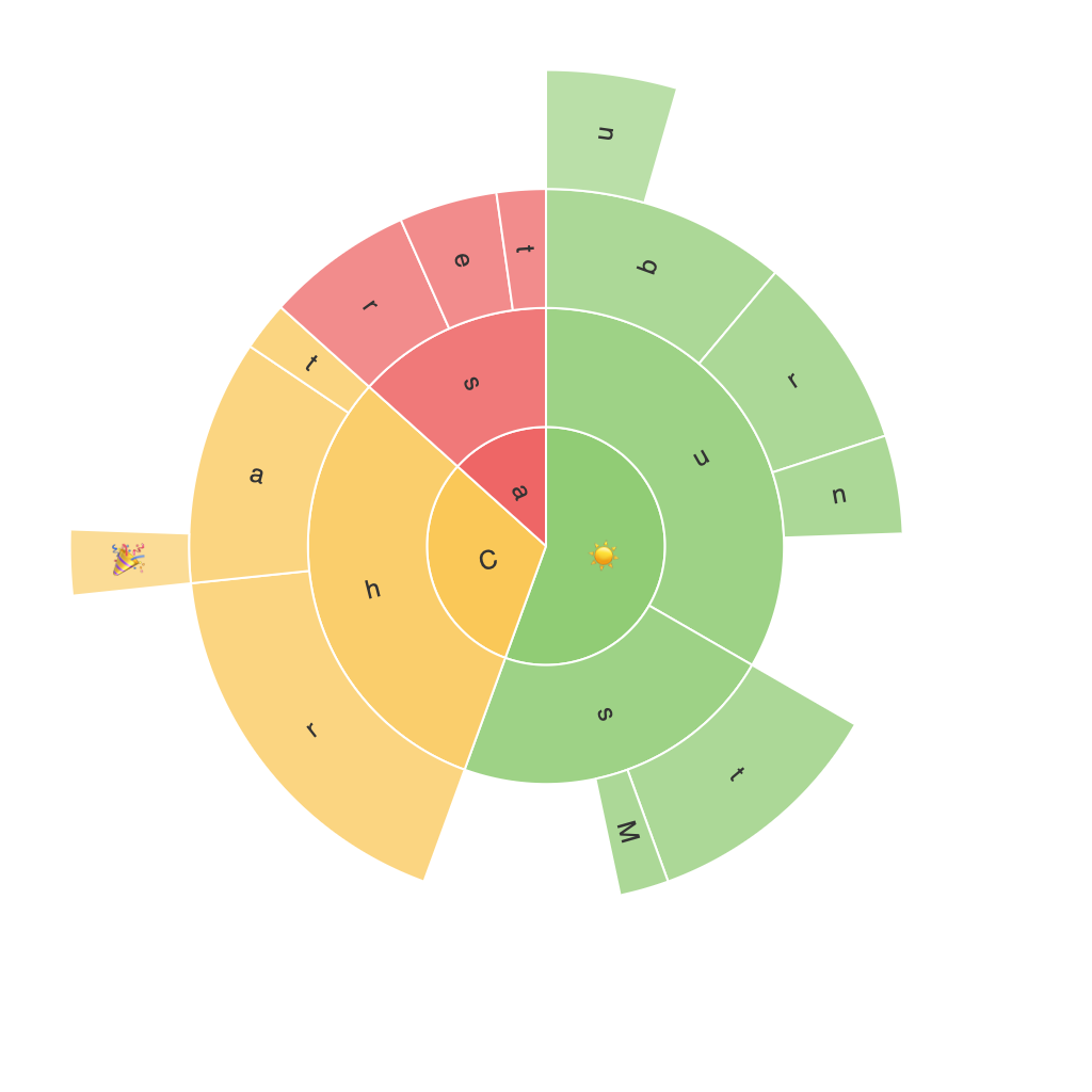
The Sunburst Chart, also known as a Multilevel Pie Chart or Ring Chart, is a radial treemap that visually represents hierarchical data. It’s particularly advantageous for visualizing multilevel data sets where one data point has multiple subcategories, offering a comprehensive view of the organization from top to bottom.
### Key Components of a Sunburst Chart
#### 1. Center Circle: The root node
The center of the Sunburst always contains the root node of the hierarchy. This circle can be customized to display specific data points, often in text form, reflecting the underlying structure of the data.
#### 2. Inner Circles: Child Nodes
Radial to the center circle are inner rings, each representing a child node under the root node. These nodes are the first level of subcategories derived from the root node.
#### 3. Further Rings: Sub-Child or Leaf Nodes
In a typical Sunburst Chart, additional rings can be added to depict sub-categories (or children of the child nodes), offering a deeper level of detail.
### How to Implement a Sunburst Chart
There are several ways to implement a Sunburst Chart:
#### Using Data Visualization Libraries:
In languages like Python (using libraries like Plotly, Matplotlib or libraries dedicated to D3.js for web applications), you can create Sunburst Charts using the `.pie()` or `.sunburst()` methods depending on the charting library.
#### Custom Programming:
For more control and specific requirements, you may write custom code using JavaScript and libraries such as D3.js, which offers extensive capabilities for data visualization and manipulation.
### Steps to Create a Sunburst Chart:
1. **Data Preparation**: Gather hierarchical data in a JSON format where each level of hierarchy is represented by nested arrays or objects.
2. **Initialization**: Set up your chart with axes, legend, title, etc.
3. **Rendering the Chart**: Use your chosen programming language or library’s functions to render the chart, layering the circles and sectors based on your data.
4. **Customization**: Add tooltips for detailed data insights, adjust color schemes, and add filters or interactions to enhance user experience.
### Analysis Techniques
Sunburst Charts are especially useful for:
– **Hierarchical Analysis**: Quickly understand how each level of a hierarchy contributes to the total.
– **Proportional Displays**: Get a sense of the proportion of each segment within its parent, assisting in comparing sizes across categories.
– **Deep Dive into Data**: Explore nested data structures with multiple layers of analysis.
### Conclusion
The Sunburst Chart is an innovative tool for displaying hierarchical data in an engaging and informative manner. By visualizing data with layers of nested circular sectors, this chart offers a unique perspective that traditional pie charts or simple tables might not provide. Its capabilities in uncovering insights within complex data sets make it an asset for data analysts and business decision-makers. Whether you’re using it for project management, financial data analysis, or any scenario that requires a clear view of hierarchical structures, the Sunburst Chart can significantly enhance your understanding through a visually compelling interface.
End of article.
