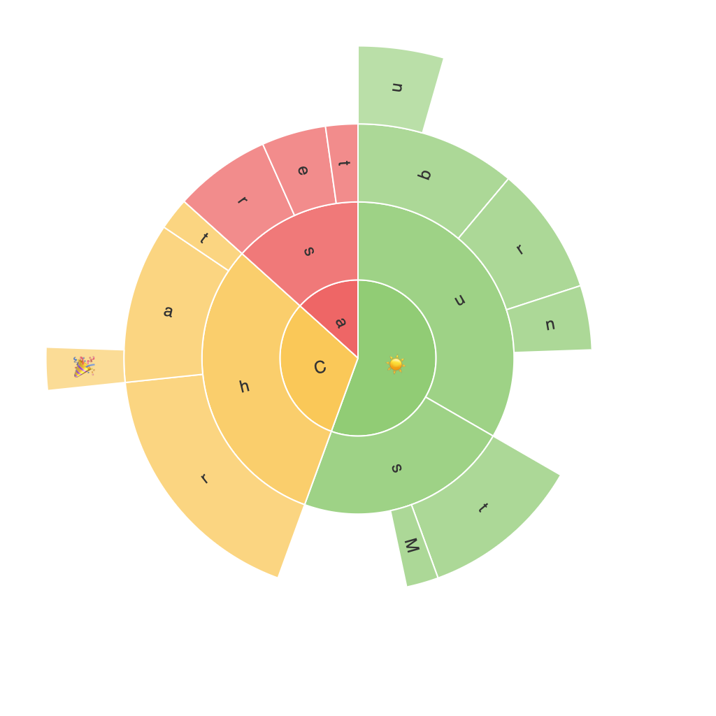
Sunburst charts are a form of hierarchical data visualization, displaying data in a way that helps users understand complex information by visualizing categories, subcategories, and other details around a central pivot point. This article will delve into the comprehensive guide to understanding, designing, and using sunburst charts effectively for insights.
### Understanding Sunburst Charts
Sunburst charts are best suited for datasets with hierarchical structures, enabling users to quickly grasp the distribution of multiple levels in the data. Unlike pie charts that often struggle with showing multiple categories elegantly, sunburst charts leverage concentric circles, each representing a hierarchical level. The size of the arcs indicates the magnitude of each category, showcasing an intuitive breakdown of parent and subcategory data.
### Key Features and Designing Effective Sunburst Charts
1. **Hierarchy Presentation**: The most straightforward feature of a sunburst chart is its visual display of hierarchical data. Each outer circle represents a higher level of the hierarchy, while each arc within contains information about the level below.
2. **Color Coding**: Colors often serve as a critical way to differentiate between categories at every level. Choosing a logical color scheme based on meaningful color attributes (like category, proportion, or trend) enhances the readability and visual appeal of the chart.
3. **Space Ratio and Depth**: The space or width of each arc reflects its contribution to the total. Ensuring adequate spacing allows users to distinguish between categories without overcrowding the chart, facilitating easier comparison and analysis.
4. **Rotation and Legends**: In case of multiple slices, rotation (around the center) or the inclusion of a legend becomes advantageous. If rotated, the chart can maintain a consistent orientation, improving readability. Incorporating a legend to detail colors or labels further enhances understanding.
### Applications and Benefits
#### Business Analytics
In business settings, sunburst charts provide executives and stakeholders with a clear overview of company structures and financial breakdowns, enabling more informed decision-making processes.
#### Web Traffic Analysis
Sunburst charts are particularly useful in representing the breakdown of various sources of web traffic, including organic search, social media, direct visits, and more, helping digital marketing teams optimize their strategies.
#### Project Management
Project managers can use them to visualize the breakdown of resources, time allocation, or project stages, offering a visual representation of project complexity and progress.
#### Product Category Analysis
Retailers and e-commerce companies leverage sunburst charts to visualize sales data across product categories and subcategories, identifying best-selling products within each category and adjusting inventory or marketing strategies accordingly.
### Conclusion
Sunburst charts, with their ability to visualize hierarchical data in a compact yet informative manner, offer significant advantages over traditional charts like pie charts and bar graphs. They are particularly beneficial in business analytics, web traffic analysis, project management, and product category analysis, where complex data structures need to be comprehended quickly and easily. By carefully utilizing these features and considering the applications, sunburst charts can unlock a wealth of insights that drive better decision-making and strategy formulation in various industries.
