Exploring the Visual Brilliance and Analytical Power: A Deep Dive into Sunburst Charts
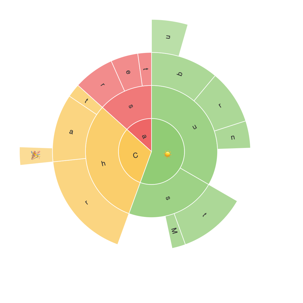
In the vast ocean of data visualization techniques, one graphical method that stands out with its combination of aesthetic appeal and analytical robustness is the sunburst chart. Often mistaken for a pie chart due to their circular nature, sunburst charts, also known as radial treemaps, offer a uniquely engaging way to represent hierarchical, multilevel data. This article delves into the visual brilliance, analytical power, and various applications of sunburst charts, illustrating how this tool can transform complex data into comprehendible, visually captivating stories.
### Visual Brilliance
The visual impact of sunburst charts is immediately noticeable. Each segment of the chart represents a hierarchical level, starting from the entire circle to individual sections. This hierarchical structure becomes apparent through the radial layout, where each ring encompasses categories with their child categories further branching out. The colors, sizes, and spacing differences between the segments create a visually dynamic representation, allowing viewers to compare parts, their relationships, and the overall proportions with ease.
### Analytical Power
Beyond their aesthetics, sunburst charts exhibit strong analytical capabilities. They are capable of representing multiple levels of data hierarchically, which makes it easier to identify patterns and relationships within data that are not evident in traditional charts. The ability to filter and hover over segments facilitates deeper dives into individual categories, enabling users to explore data from various perspectives.
### Applications
Sunburst charts find applications in numerous fields where hierarchical data visualization is essential. Here are a few examples:
1. **Categorization and Segmentation** – In market research, sunburst charts can display product hierarchies, showing how different segmentations of a product (like brand, type, price range) contribute to overall sales, helping businesses understand consumer behavior across various categories.
2. **Audience Analysis** – In digital media, sunburst charts can track user engagement across different platforms, categories, or content types, providing insights into what demographics consume what type of content.
3. **Financial Analysis** – In finance, they can be used to represent asset portfolios, showing the allocation of investments across different categories (stocks, bonds, real estate), sectors, and geographical segments, aiding in strategic planning.
4. **Data Visualization in Software Engineering** – For tasks like decision-making in project management, sunburst charts can display the structure of a project’s tasks, components, and workflows, helping teams visualize and manage complex project dependencies.
### Customization and Interactivity
Modern tools often provide advanced customization options for sunburst charts, allowing users to adjust elements such as colors, labels, tooltips, and the use of animated transitions to enhance user engagement. Interactive features, including tooltips and data brushing, also add a layer of functionality, enabling seamless exploration within the chart.
### Conclusion
Sunburst charts are not just visually appealing graphical tools but also powerful analytical assets, offering a unique approach to data presentation and analysis. Their adaptability across various industries and the ease with which they handle complex, hierarchical data make them a valuable addition to the data visualization toolkit. As the need for intuitive and accessible data representation grows, the potential of sunburst charts in enriching understanding and decision-making processes continues to expand.
