Unveiling the Clarity and Impact of Sunburst Charts: A Comprehensive Guide to Visualization and Data Analysis
Sunburst charts, also known as sun charts, spider web charts, or disk and chord diagrams, represent hierarchical data in a visually enticing way. Unlike the traditional pie chart, which represents elements based on their percentage of the total, sunburst charts emphasize relationships and provide a clearer depiction of the hierarchical structure. This unique visualization technique makes it an indispensable tool in data analysis and business intelligence.
Structure and Components: Delving into the Anatomy of a Sunburst Chart
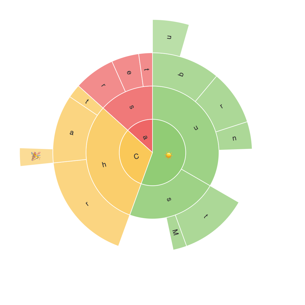
A sunburst chart is composed of concentric rings and segments, with each segment representing a part of the whole. The innermost ring contains the root node, and the outer rings gradually separate into child segments. This hierarchical representation allows users to explore nested data and understand the composition and relationships of different elements at various levels.
Advantages of Using Sunburst Charts
1. Hierarchical Clarity: Sunburst charts excel at presenting hierarchical information in a clear and visually appealing way. By displaying data at multiple levels, users can effortlessly navigate through different tiers of information without being overwhelmed.
2. Comparative Analysis: Sunburst charts enable direct comparisons between nodes within the same level. By visualizing the size of segments, users can quickly identify patterns and relationships within the data.
3. Space Efficiency: Unlike more complex tree diagrams or heat maps, sunburst charts make efficient use of space, allowing multiple levels of the hierarchy to be represented without clutter.
4. Aesthetic Appeal: The color-coded and visually distinct nature of sunburst charts attracts attention and aids in the creation of engaging and intuitive visual representations, often leading to better communication of insights.
Utilizing Sunburst Charts for Data Analysis
Sunburst charts find application in a variety of fields, including business, marketing, finance, and social sciences. Here are a few scenarios where sunburst charts prove their worth:
1. Organization Structure: Visualizing the organizational hierarchy, where different departments, teams, or job roles are depicted as segments, provides a clear view of the composition and relationships within the company.
2. Product Analysis: Analyzing how sales are distributed across product categories, product lines, or salespeople in a visually intuitive manner. This allows for the identification of high- and low-performing segments within the business.
3. Budget Allocation: Understanding how funds are allocated across departments or projects, highlighting areas that may need additional review or adjustment, and emphasizing effective spending patterns.
4. Web Analytics: Exploring user navigation patterns through a site, where segments represent different pages or categories, can help identify the most and least accessed sections of the website.
Challenges and Enhancements
Although sunburst charts are powerful data visualization tools, they come with certain limitations. Overcrowding, especially when dealing with a large number of categories or complex data sets, can make the chart confusing instead of helpful. To overcome this, consider the following tips:
1. Simplify: Focus on the most significant categories first, leaving less relevant or less populated segments for secondary views.
2. Interactive Elements: Implement interactive features like tooltips and drill-down capabilities to allow users to explore data in-depth without cluttering the main chart.
3. Color and Themes: Use vivid and distinct colors for different segments and apply consistent themes for enhanced clarity and visual appeal.
4. Data Aggregation: When dealing with a vast amount of data, consider groupings or percentages to represent categories, reducing clutter and improving digestibility.
Conclusion
Sunburst charts offer a unique and insightful way to visualize hierarchical data, providing a clearer depiction of both the composition and relationships within the data set. By leveraging the power of these charts, users can make better-informed decisions based on the revealed patterns and insights. As with any data visualization technique, consider the specific use case and data volume to determine the most effective way to utilize sunburst charts for your particular project or analysis.
