### Exploring the Visual Impact and Versatility of Sunburst Charts: A Comprehensive Guide for Data Visualization
Within the vast landscape of data visualization, various tools and techniques have emerged to help analysts, designers, and scientists better comprehend complex datasets. Amidst these, a chart that has gained significant traction due to its ability to represent hierarchical, multilevel data visually is the sunburst chart. This article serves as a detailed guide, delving into the intricacies and advantages of the sunburst chart, explaining how it differs from other charts, and showcasing its applications across various domains.
#### What is a Sunburst Chart?
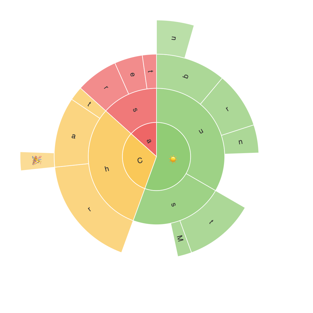
A sunburst chart, also known as a radial treemap, is a visual representation that efficiently illustrates a hierarchical data structure in its full dimensions. Each level of hierarchy is depicted in the chart, with outer rings representing the top level, middle rings showing the second level, and inner rings indicating the bottom level. This structure allows the display of deeper nested data in multiple dimensions, making complex hierarchies accessible and meaningful.
#### Design and Structure
**Segments:** Each segment in the sunburst chart represents a specific data point or category, which is further segmented and nested according to its hierarchy within the dataset. The size of each segment often correlates to a specific attribute, such as the quantity or percentage of the total value, providing immediate insights into the relative importance of each category.
**Radiating Structure:** The layers and sectors of the chart are arranged radially, emanating from a central hub, which symbolizes the highest level of the hierarchy. This layout makes it easy to compare relationships and sizes of different components at a glance.
#### Advantages and Versatility
**Versatile Data Representation:** Unlike traditional pie charts or Venn diagrams, sunburst charts effectively show the relationship between parent and child nodes, making them particularly useful for data with many levels of categories. This attribute is significantly beneficial in scenarios where data has deep hierarchy structures, often requiring complex representations.
**Enhanced User Understanding:** The clear and intuitive layout of sunburst charts enhances user comprehension, enabling viewers to grasp hierarchical relationships and proportions quickly. This visual clarity is particularly valuable in decision-making processes, where stakeholders must understand complex data sets.
**Space Efficiency:** Especially in comparison to tree maps, sunburst charts do not suffer from the spacing issues that can arise from tree maps, maintaining a clear distinction between each segment, which increases readability and aesthetics.
#### Use Cases
Sunburst charts find applications across multiple fields, including business intelligence, market analysis, information visualization, and more. Key areas of use include:
– **Financial Analysis:** To visualize financial data, where sectors (like revenue streams) are broken down into sub-segments (sub-divisions of companies or departments).
– **Biological Data:** In bioinformatics, sunburst charts can represent genetic tree structures or classifications of organisms based on various traits or categories.
– **E-commerce Insights:** To dissect sales data, with product categories segmented further into popular sub-collections or individual products.
– **Web Analytics:** For website user tracking, where different layers could represent different levels of user engagement, categorized by demographics, activities, or user paths.
#### Conclusion
The sunburst chart stands as a powerful tool for data visualization, offering a unique and insightful perspective on hierarchical and multi-level datasets. Its versatility and ability to elegantly display complex information in a comprehensible form make it a preferred choice for businesses, researchers, and data analysts. Whether you’re looking to enhance your business intelligence presentations, explore biological classifications, or analyze user journey paths, the sunburst chart provides a visual impact that truly empowers data-driven decision-making.
