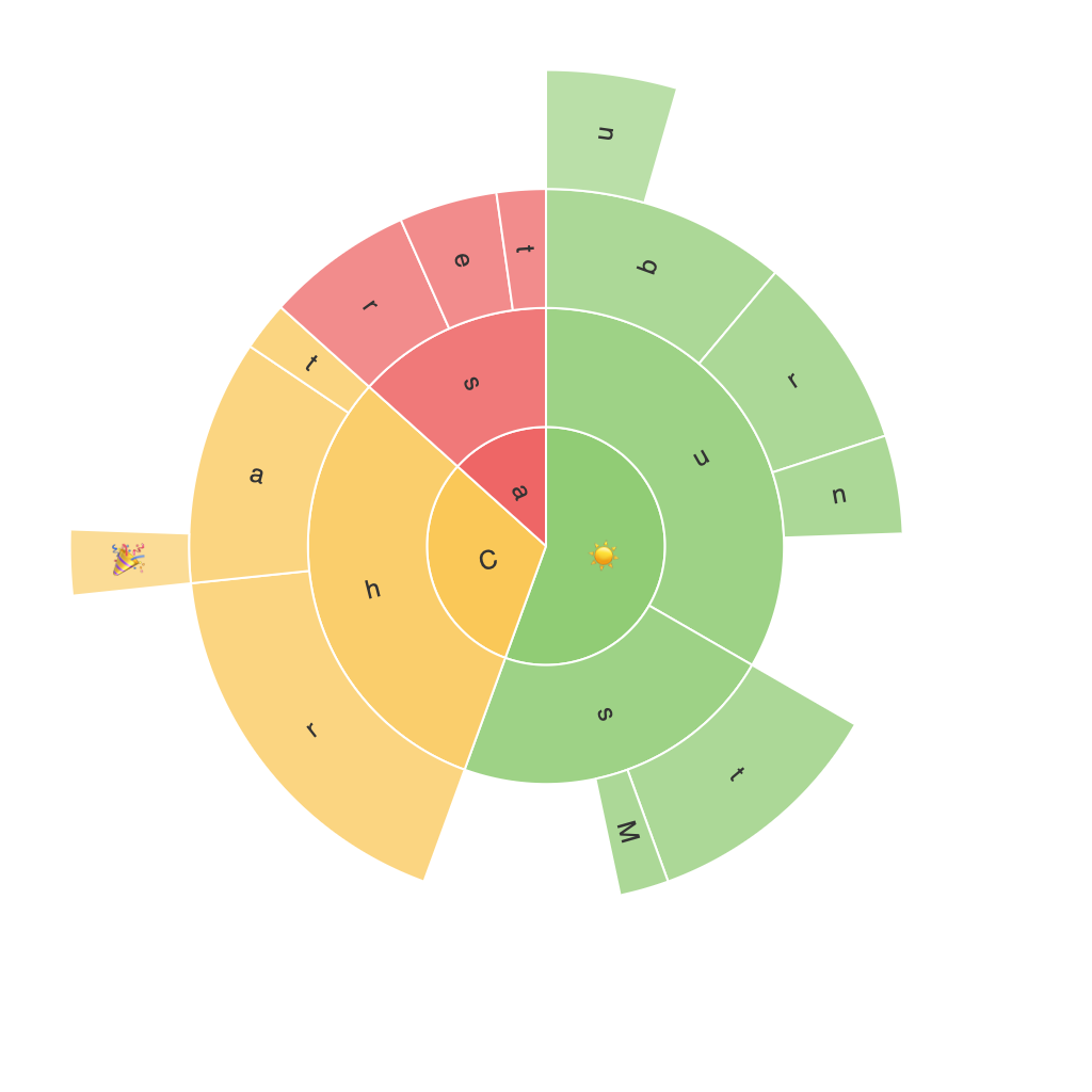
Unlocking Insights with Sunburst Charts: A Comprehensive Guide to Visualization and Data Exploration
Sunburst charts, also known as ring charts or multi-level pie charts, provide a unique way to visualize hierarchical data in a clear and aesthetically appealing manner. They are essential for businesses, researchers, and data analysts who wish to efficiently explore, understand, and communicate complex relationships within their datasets. In this article, we delve deep into the world of sunburst charts, explaining what they are, how to create them, and the benefits they offer for data visualization.
### What are Sunburst Charts?
Sunburst charts are a type of radial tree diagram where each level of the hierarchy is represented in a ring around the center. The innermost ring represents the topmost category, with subsequent rings displaying the subcategories beneath each. The size of each segment is proportional to the quantity or value it represents, making it easy to identify dominant elements within the data structure.
### Why are Sunburst Charts Important?
Sunburst charts facilitate the following key advantages:
1. **Visualization of Hierarchical Data**: They excel at representing complex hierarchical data, such as the breakdown of product categories by sales or the components of a budget.
2. **Comparison and Identification**: By visually comparing the sizes of segments within the rings, viewers can easily identify which parts of a hierarchy dominate.
3. **Trend Recognition**: Sunburst charts help in recognizing trends or clusters within data without the clutter typically found in flat tables or large multi-dimensional bar charts.
4. **Detailed Exploration**: They allow for easy drilling down into the hierarchy by expanding segments, providing detailed insights into various levels of data.
### Creating Sunburst Charts
Most data visualization tools, including Tableau, Power BI, Google Charts, and Python libraries like Plotly and Matplotlib, offer the capability to create sunburst charts. The steps typically involve:
1. **Data Preparation**: Ensure your data is organized with a hierarchy that can be clearly mapped onto the chart’s concentric circles. A sample structure might look like this: Category -> Subcategory -> Category Type.
2. **Mapping Data**: Assign categories to rings, subcategories to segments within rings, and values to the size or color of segments. Some tools automatically handle this mapping based on the column headings.
3. **Design Customization**: Tailor your sunburst chart’s aesthetics with colors, labels, animation, and other visual elements to enhance readability and appeal.
4. **Interactivity**: Implement interactive features such as tooltips, zoom, and hover effects to provide additional information on demand, allowing users to explore the data in depth without cluttering the chart.
### Using Sunburst Charts in Data Exploration
When integrating sunburst charts into your data exploration toolkit, consider the following strategies:
– **Focus on Key Metrics**: Prioritize visualizing data around the most significant metrics or segments, which often convey the most impactful insights.
– **Limit Depth**: Ensure the hierarchy isn’t too deep to maintain readability and understanding. Complex hierarchies might benefit from sub-charts or drill-down features.
– **Compare Across Similar Categories**: Use sunburst charts to compare different sets of categories or metrics, highlighting similarities and differences in a visual format.
– **Consistent Hierarchy**: Maintain a consistent hierarchy and scale across different data sets to ensure comparability and ease of analysis.
### Conclusion
Sunburst charts are a powerful tool for data visualization, especially when dealing with hierarchical datasets. They offer a clear and interactive way to represent complex relationships within a visually engaging format. Whether you’re analyzing business performance, social dynamics, or any structure of data, sunburst charts provide a comprehensive guide for exploration and insight discovery. With proper data preparation, tool selection, and customization, you can unlock valuable insights from your data, enhancing decision-making and enabling more effective communication of your findings.
