Unleashing the Power of Insight: A Comprehensive Guide to Mastering Sunburst Charts
Sunburst charts are a fascinating tool for data visualization. They provide an effective way to display hierarchical data, making it easy to navigate, understand, and unveil insights that might be hidden in more complex or dense datasets. For those seeking to uncover deeper dimensions of their data, mastering these graphical representations isn’t just a matter of interest; it’s a step toward enhancing your analytical capabilities. This guide brings forth a comprehensive approach to understanding and effectively utilizing sunburst charts.
### Understanding the Basics
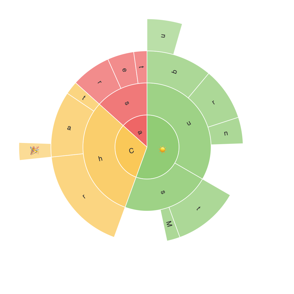
Sunburst charts are an evolution of the popular pie chart, offering multi-layered segments to display various levels of a hierarchy. Each level unfolds like rays emanating from the center, with segments representing categories, and their size relative to the whole. Colors are used to distinguish between various groups, enhancing readability and the overall visual appeal of the chart.
### Key Elements and Components
1. **Center Radius** – Represents the deepest level of hierarchy. This layer typically shows top-level categories.
2. **Segments (Fans)** – These represent sub-levels in the hierarchy and are placed radially around the center. Their size often reflects the importance or quantity of the data they represent.
3. **Arc Segments** – These are divided segments of the ‘fans’, further partitioning each sub-category into their respective sub-elements. Colors distinguish one category from the other or represent a gradient of value.
### Advantages and Applications
#### Visual Clarity
Sunburst charts excel in making hierarchical data more comprehensible. Each level is separated, allowing for a clearer view of the data structure compared to a pie chart.
#### Data Depth
They are ideally suited for conveying multiple levels of detail. If each ray, arc, or segment contains data values, consumers can easily decipher the breakdown of the hierarchical structure.
#### Trend and Pattern Discovery
Visual patterns and trends are easily recognizable in these charts, making it a great tool for exploratory data analysis. It’s much easier to spot trends than in tables or bar charts.
### Creating Sunburst Charts
For beginners looking to dive in, tools such as Tableau, Power BI, or even Python libraries like Plotly and Matplotlib make it remarkably simple to create sunburst charts. Simply provide your hierarchical data, select the visualization type, and your chart is ready. The real art, however, lies in how you manipulate data and make the most of the chart’s capabilities.
### Examples and Customization
#### Custom Legends
Creating a legend aids in quick reference for the color coding used across different segments. Customizing this to match your brand’s color scheme enhances user accessibility and visual harmony.
#### Dynamic Interactivity
Implementing tooltips and clickable segments allows users to drill down deeper into specific sections with more detail. This is particularly useful for complex data sets where every section may carry valuable insights.
### Final Thoughts
The journey to mastering sunburst charts involves not just understanding their theoretical aspects but also practical application and creative customization. With this comprehensive guide, you are equipped to interpret, present, and utilize hierarchical data more effectively. Sunburst charts offer a unique and powerful approach to data visualization, capable of empowering you to make insightful discoveries that might otherwise remain hidden. Invest the time in learning and utilizing this tool, and watch your ability to uncover and communicate intricate data insights soar.
