Exploring the Visual Power of Sunburst Charts: A Guide to Mastering Data Representation and Analysis
Sunburst charts, a visually stunning graphical representation, are increasingly being employed in various sectors to analyze and represent data in a more digestible manner. Not only do they provide an aesthetically-appealing alternative to traditional pie charts and treemaps, but they also possess the unique capability to represent hierarchical data structures, thereby enhancing the depth and breadth of information conveyed. This article aims to guide you through the intricacies of mastering the use of sunburst charts as a sophisticated tool for data visualization and analysis.
Understanding the Components: Structure and Design
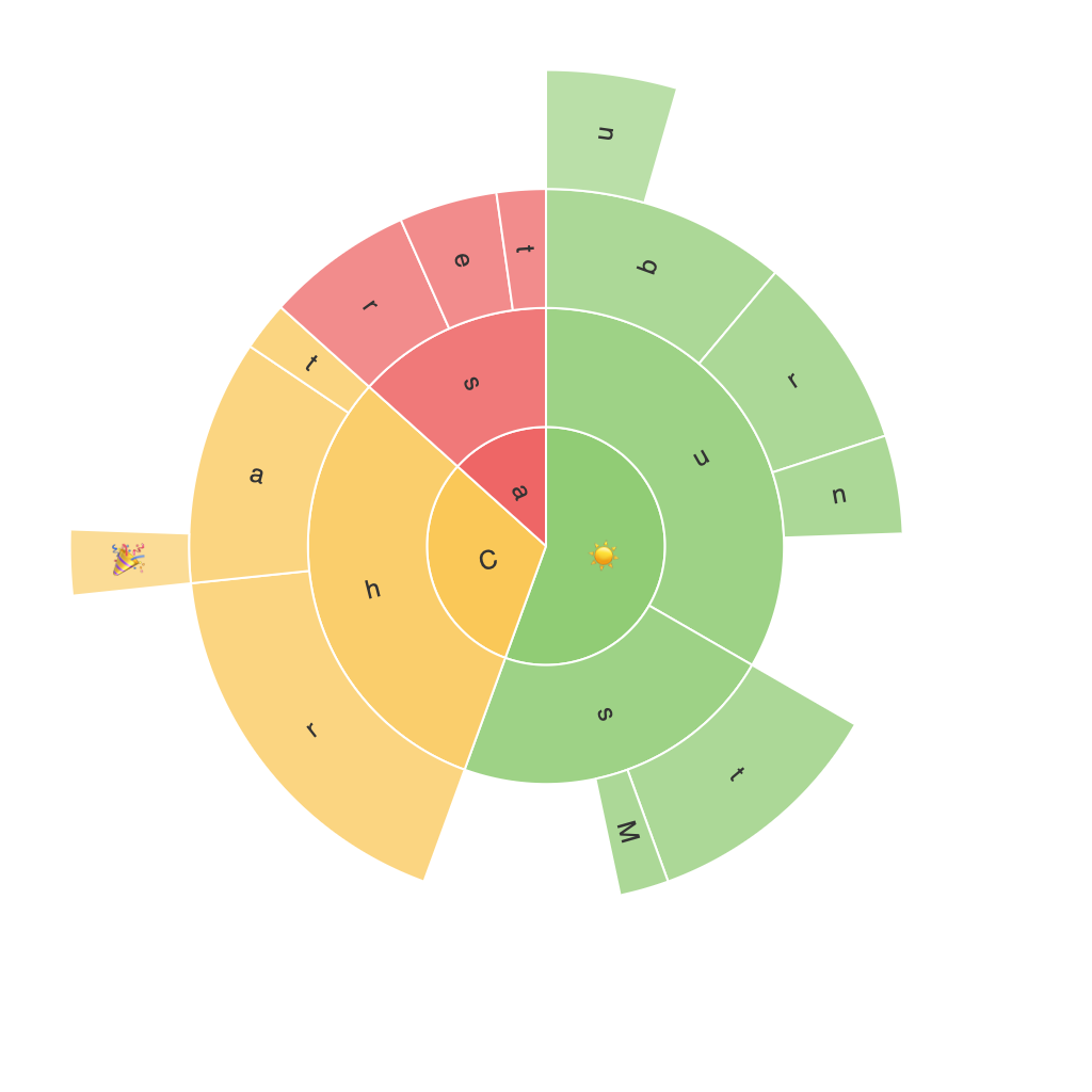
At the heart of every sunburst chart lies its circular shape, radiating outwards into segments or rays that represent different levels of a hierarchical structure. The center of this circle is often an empty space, symbolizing the root or the highest level of the hierarchy. Surrounding this are concentric rings, where each ring represents an additional level of the hierarchy. Segments formed from these rays are further divided based on the data distribution, either by numerical value or through color codes, allowing for easy differentiation and comparison.
Mastering Data Hierarchy:
A key difference between sunburst charts and other data visualizations lies in their ability to depict hierarchical relationships. To effectively visualize complex datasets, it’s crucial to understand how to organize your data appropriately. For instance, when visualizing a company’s sales breakdown across various product categories, regions, and time periods, a well-structured sunburst chart can reveal insights at each level, highlighting trends and patterns that might not be as clear in alternative formats.
Color Coding and Value Scaling:
One of the most powerful aspects of sunburst charts is their use in color coding and value scaling. Colors can be assigned to signify different categories or to indicate the magnitude of data values, providing a visual key for the reader. Value scaling by size, in turn, allows for immediate comparisons even across large datasets. For example, in a sunburst chart showing a corporation’s revenue sources, larger segments could represent higher revenue-generating activities, making it easy to identify priorities or pain points.
Interactivity – Enhancing User Engagement:
In the digital age, interactive elements in charts are more than just a luxury – they’re an essential feature. When integrating sunburst charts within digital dashboards or reports, enabling interactivity can significantly drive user engagement and data exploration. Features such as drilling down into specific segments, hovering over to see detailed information, or even comparing segments side by side can greatly enhance the analysis experience, leading to more informed decision-making.
Tools and Platforms:
Choosing the right tools plays a crucial role in the process of creating effective sunburst charts. Popular data visualization platforms such as Tableau, PowerBI, and Alteryx provide robust features for designing, customizing, and publishing sunburst charts. These tools offer various templates and customization options, making it easier for users to adapt the chart’s design to their specific needs.
Case Studies: Real-world Applications
The visual power of sunburst charts is not confined to the realm of theoretical understanding. Several industries have successfully employed this technique to enhance their data analysis processes. For example, a financial consulting firm used sunburst charts to visualize the breakdown of revenue streams for diverse industries, helping clients better understand market performance and strategize for future growth. In the tech sector, companies frequently use these charts to represent the structure of a software project, including different modules, functionalities, and their respective importance within the system.
Conclusion:
In the realm of data visualization, sunburst charts stand out as sophisticated tools that are more than just an aesthetically-pleasing addition to any report. They serve as invaluable aids in representing hierarchical data, revealing insightful trends, and supporting informed decision-making. By following the principles outlined in this article, mastering the art of crafting effective sunburst charts can elevate data analysis to new heights, providing clarity, depth, and insight to complex datasets.
