Title: Unlocking the Insights: A Comprehensive Guide to Sunburst Chart Usage and Design
Introduction:
The sunburst chart is a visually intriguing and powerful tool in data visualization, enabling the representation of hierarchical data in a concentric circular layout. This guide aims to demystify the complexities of creating and interpreting sunburst charts, ensuring that they effectively communicate the story behind the data to your audience.
Understanding the Basics:
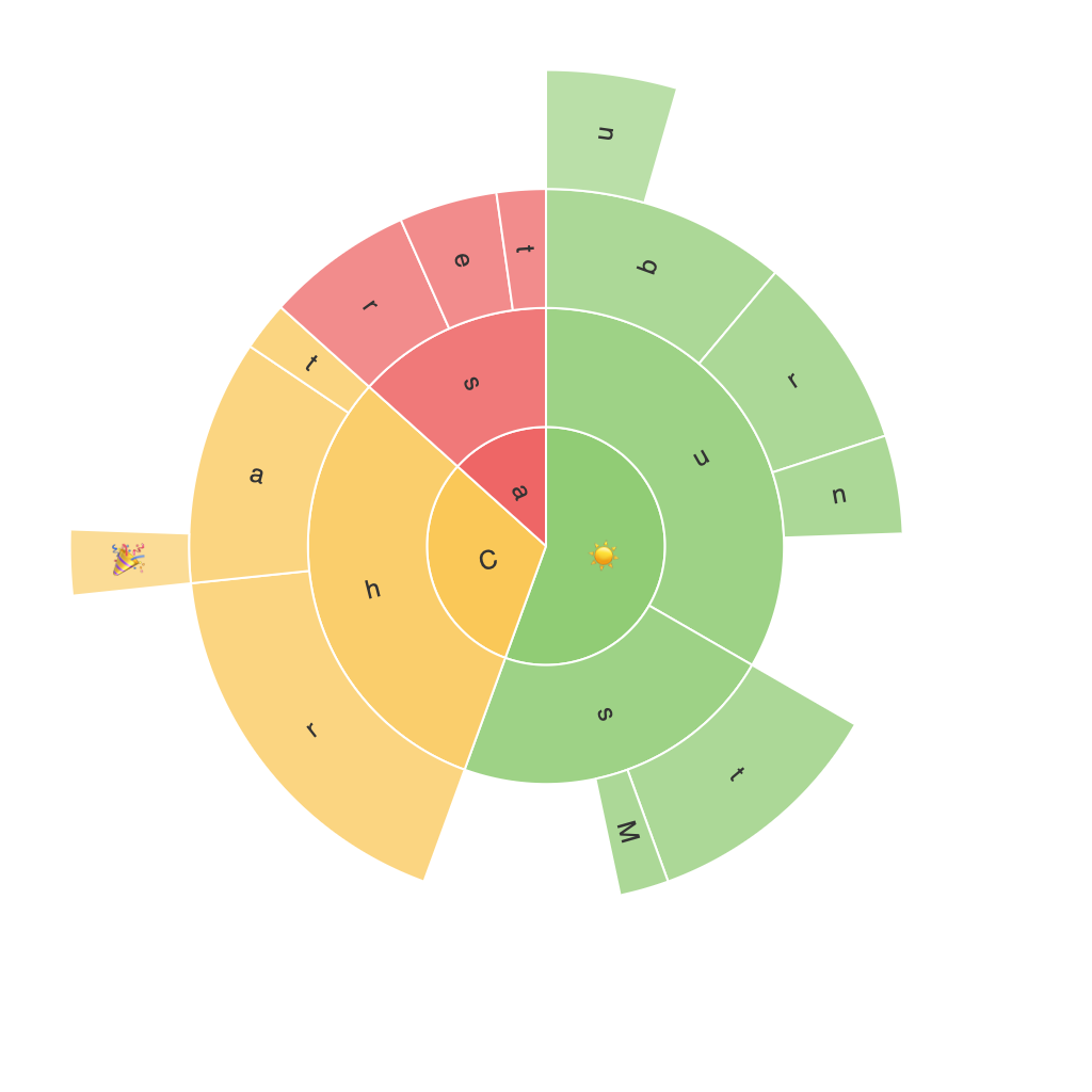
Sunburst charts visually represent categories at each level of a hierarchy. The center of the chart typically represents the top category, and succeeding layers represent the subcategories, each decreasing in circle size as you move outward. The angles of the segments in each layer reflect the percentage contribution of each subcategory to the whole.
Designing a Sunburst Chart:
To efficiently use a sunburst chart, start by gathering your data, ensuring it’s in a hierarchical format that can easily be mapped onto the chart’s structure. Tools like Tableau, PowerBI, or Python libraries such as Plotly and Matplotlib offer robust functionalities to create and customize sunburst charts effectively. Consider the following design considerations:
1. **Color Scheme**: Opt for a consistent and distinct color scheme that enhances readability and helps differentiate between various categories. Use contrasting colors to highlight important subcategories without overwhelming the chart.
2. **Segment Labels**: To avoid clutter, use the space effectively with clear and concise labels. Label the outermost segments with direct descriptions if space permits or utilize a tooltip feature for detail-rich subcategories.
3. **Animation**: Adding animations, such as hover effects or interactive transitions, to the chart can significantly enhance user engagement. Animations should be subtle, guiding the user’s visual attention to new information without disrupting the natural flow of data exploration.
4. **Sizing and Space Allocation**: Adjust the sizing of segments in each layer to reflect the proportional contribution of each subcategory. Adequate spacing between the layers is crucial for maintaining visual clarity and ensuring that the chart is easy to read.
5. **Legend and Hover Information**: Including a legend can be particularly helpful for more complex charts where direct labels on segments might become overwhelming. A well-structured legend should be clearly labeled and positioned to cater to both visual and cognitive navigation.
Interpreting the Data:
Once your sunburst chart is designed and implemented, the real challenge lies in interpreting the data effectively:
1. **Pathway of Decision-Making**: Sunburst charts excel at illustrating pathways of decision-making or stages in processes. Each level of the chart can represent a step in the process, allowing viewers to trace the flow from initial categories to final outcomes.
2. **Identifying Dominant Subcategories**: By visually comparing segment sizes, users can quickly identify which subcategories significantly contribute to the overall total. This can be crucial for decision-making processes, highlighting areas that need attention.
3. **Comparative Analysis**: When multiple sunburst charts are presented, such as across different time periods or categories, they enable comparative analysis. This helps in assessing changes, trends, or anomalies in hierarchical data.
Conclusion:
Using sunburst charts can be a powerful method for visualizing hierarchical data structures, making complex relationships and proportions easily discernible. By understanding the basics, effectively designing these charts, and interpreting the data with precision, users can unlock deeper insights and facilitate better decision-making processes. This chart is especially useful for organizations with extensive product or service hierarchies, making it a valuable tool in various sectors like e-commerce, finance, and project management.
