Sunburst Charts: Decoding Complexity and Unleashing the Power of Visual Data
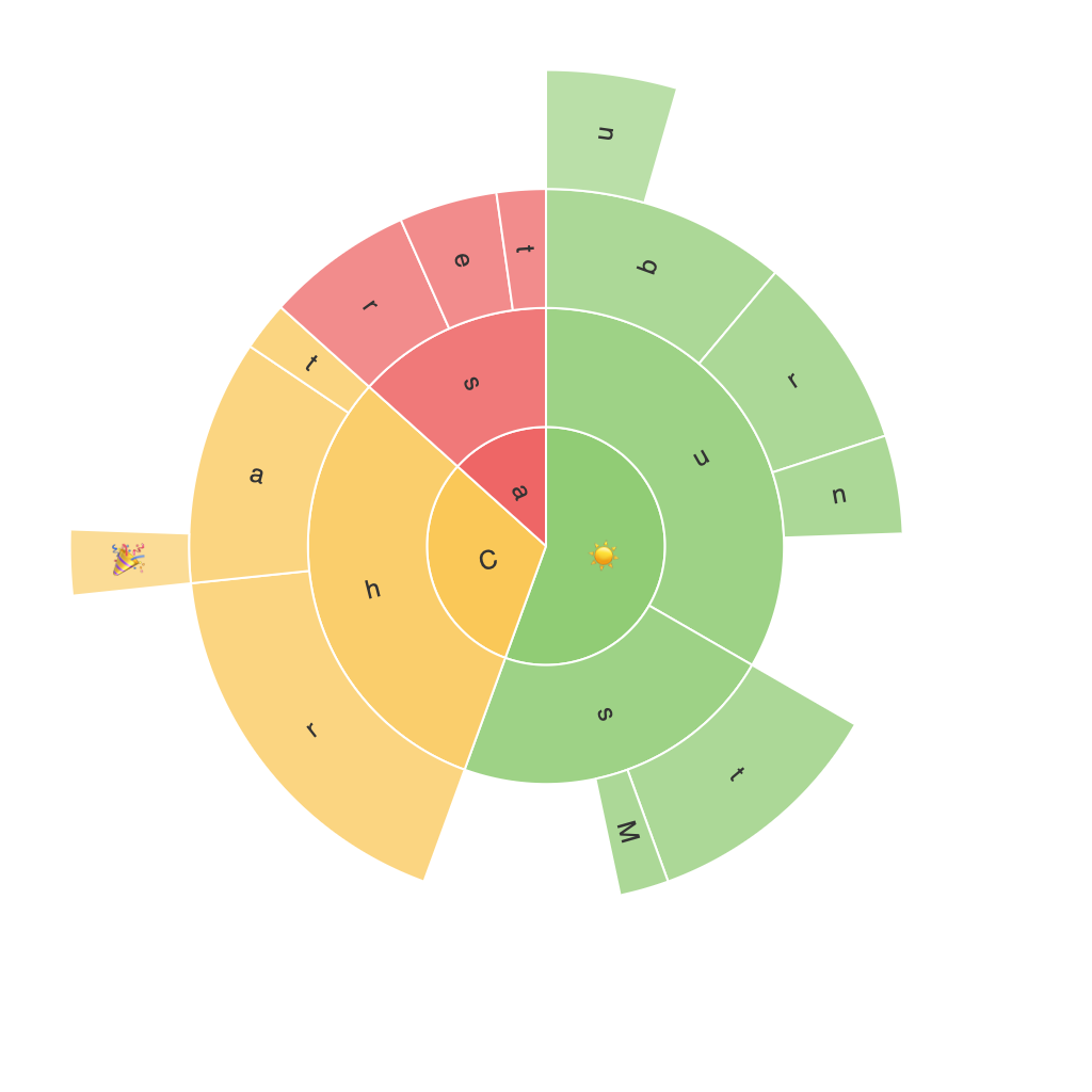
Sunburst Charts are unique visual depictions of hierarchical data that convey complex information in a visually engaging and digestible format. These charts provide an expansive, radial visual representation where each level of the hierarchy is represented by a concentrically arranged ring or series of segments in the chart. In this article, we’ll delve deeply into the power of Sunburst Charts and explore their diverse applications in the world of data visualization.
### Key Elements and Their Significance
#### 1. Rings and Segments
Each ring in the Sunburst Chart corresponds to a hierarchy level, and segments within each ring represent categories at a specific level. This radial layout enables the viewer to traverse the hierarchy progressively, with each level offering a layer of detail.
#### 2. Color Coding
Color coding plays a crucial part in differentiating segments and visualizing patterns or trends. It adds a layer of complexity management, making it easier for users to discern relationships and differences between categories.
#### 3. Size and Segments’ Area
The area of a segment is often proportional to the value it represents. This aspect helps in quickly grasping the significance of each category at a glance, making it an effective tool for highlighting dominant or lesser contributing elements within a hierarchy.
### Power and Applications
#### 1. **Hierarchical Data Visualization**
Sunburst Charts excel in visualizing data with a multitude of categories at various levels of hierarchy. They’re particularly effective in business intelligence and strategic planning contexts for showing organizational structures, sales funnel breakdowns, or product category distributions.
#### 2. **Trend Analysis**
As hierarchical data is naturally sequential, Sunburst Charts provide an intuitive framework for spotting trends and patterns. Users can easily trace how smaller categories contribute to larger ones, revealing insights into the source of high or low totals.
#### 3. **Comparison and Contrast**
The visual nature of these charts allows for direct comparison between different categories within a hierarchy. Users can quickly identify which segments are driving the overall growth or represent the largest portions of the dataset.
#### 4. **Data Density and Complexity Management**
By offering a single, comprehensive view of hierarchical data, Sunburst Charts help manage information density, enabling viewers to grasp multiple levels of data simultaneously without the clutter typically associated with more linear visualization methods.
#### **Practical Implementations**
– **Web Analytics:** To analyze user flows through a website, showing how users navigate from landing pages to specific content areas.
– **Financial Forecasting:** In financial data sets, to illustrate revenue streams, expenses, and profit contributions, breaking down income from various departments or business units.
– **Project Management:** To structure project tasks and resources, clearly identifying high-level objectives and the breakdown towards reaching them, highlighting dependency relationships and resource allocation.
### Conclusion
The Sunburst Chart’s unique ability to convey hierarchical data through a visually intuitive format makes it a powerful tool in the data visualization arsenal. Its capacity to manage complexity, enable insightful trend analysis, and provide a comprehensive view of nested data structures makes it relevant across numerous domains including business intelligence, finance, marketing, and beyond. By leveraging the full potential of Sunburst Charts, data professionals can unlock deeper insights and communicate complex information more effectively.
