### Unleashing Insights with a Sunburst Chart: A Comprehensive Guide to Enhancing Data Visualization
In the vast landscape of data visualization, one tool stands out for its capacity to illuminate complex hierarchical relationships: the sunburst chart. This innovative visual representation has revolutionized the way we interpret and engage with data that holds intricate layers and dimensions—making it especially valuable for organizations and analysts seeking to unveil detailed insights without drowning in complexity. This article serves as your comprehensive guide to mastering the art of unearthing insights with a sunburst chart.
#### What is a Sunburst Chart?
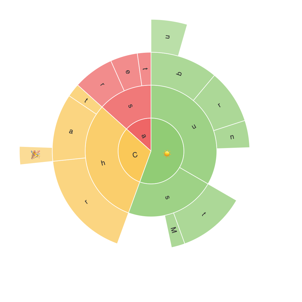
The sunburst chart, also known as a sun chart or sun flower plot, is a type of hierarchical chart that visualizes data through concentric circles with the central circle being the root. Radiating out from the center are segments which represent subcategories, forming the branches of the chart. Each level further radiates into smaller segments, representing more granular details. This design is not only visually striking but brilliantly adept at representing hierarchical data, making it an indispensable tool in data science and analytics.
#### Benefits of Using a Sunburst Chart
1. **Hierarchical Clarity**: Sunburst charts excel at displaying multiple levels of hierarchy in a compact manner. This makes it easier than traditional tree structures or charts with many levels to visualize the same information.
2. **Space Efficiency**: By using concentric circles, the chart can display large amounts of data without the clutter that comes with too much text or labels.
3. **Ease of Navigation**: Users can quickly understand the structure and relationships within the data. The visual layout encourages exploration and helps in identifying patterns and trends.
4. **Comparison and Segregation**: It allows for easy comparison between different categories and subcategories, highlighting areas of importance through color and size variations.
#### How to Create a Sunburst Chart
Creating a functioning sunburst chart usually involves these steps and might require more technical know-how:
1. **Data Preparation**: Ensure your data has a clear hierarchical structure—each item must have a parent and possibly multiple children. Prepare this structure in a way that can be read by your visualization tool.
2. **Choosing the Right Tool**: Depending on your preference and the complexity of data, choose a programming language or a data visualization library. Popular options include Python (using libraries like Plotly, Holoviews), JavaScript (using libraries like D3.js, or even charting libraries like FusionCharts), and others.
3. **Implementation**: Use the syntax and methods of your chosen tool to create the sunburst chart. Typically, you will need to transform your data into an appropriate JSON format or a specific data structure recognized by your visualization library.
4. **Customization**: Tailor your chart with colors, labels, and possibly animations to enhance readability and visual appeal.
5. **Validation and Feedback**: Test your sunburst chart with stakeholders or users to gather feedback for improvements.
#### Best Practices for Effective Use of Sunburst Charts
1. **Limit Depth**: Too many levels can make a sunburst chart cluttered and hard to read. Aim for a reasonable depth, typically no more than 3-4 levels, to maintain clarity.
2. **Consistent Color Coding**: Use consistent colors across the chart to represent the same categories. This helps in maintaining a clear and coherent visual representation.
3. **Label Management**: Optimize label placement to avoid overlap, which can be a common issue in this type of chart. Consider using techniques like adjusting text size, rotation, or placement algorithms.
4. **Focus on Relevance**: Highlight areas based on their importance, such as using color gradients to emphasize high-impact segments.
5. **Interactive Elements**: Where possible, make your sunburst chart interactive to allow users to explore deeper into the data. Interactive features can include tooltips, clickable segments, or additional information pop-ups.
#### Conclusion
The sunburst chart, a powerful tool in the arsenal of data visualization, enables analysts and decision-makers to engage effectively with complex hierarchical data. Its ability to provide concise, visually appealing representations of data sets it apart in revealing insights that might be obscured in more conventional chart forms. By mastering the creation and customization of sunburst charts, one can significantly enhance their ability to communicate data effectively and drive informed decision-making processes.
