### Exploring the Visual Impact: A Deep Dive into Sunburst Charts – Understanding Their Structure, Applications, and How to Create Them
Sunburst charts are an intriguing and increasingly popular addition to the array of data visualization tools, offering a visually striking approach to displaying hierarchical data comprehensively. These charts are not just visually engaging but also provide a deeper understanding of relationships within the data compared to their counterparts. This article aims to delve into the structure of sunburst charts, their wide range of applications, and guide readers through the process of creating them.
#### Understanding the Structure of Sunburst Charts
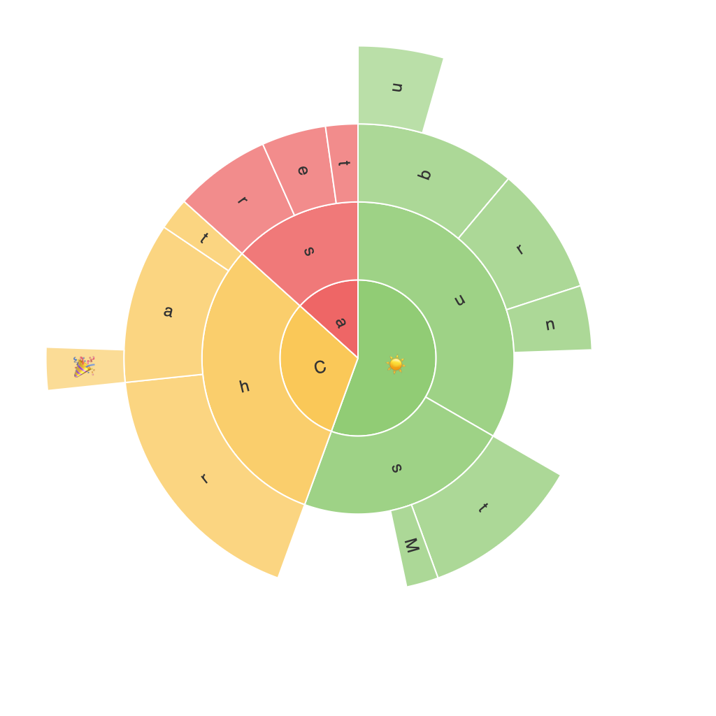
Sunburst charts are essentially multi-level pie charts used to visualize hierarchical datasets. The center of the chart typically represents the root node of the hierarchy, branching out into sectors representing the next level. Each sector then expands into its own set of sectors, further detailing the underlying relationships and divisions within the data. The outer rings of the chart continue this pattern, allowing for the visualization of up to three levels of hierarchy in a single chart.
The use of color gradients, varying sizes and shapes of the sectors, and clear labels enhance the readability and aesthetic appeal of sunburst charts. This structure not only makes the chart visually appealing but also aids in the identification of patterns, trends, and connections within the data.
#### Applications of Sunburst Charts
Sunburst charts find applications in various domains where hierarchical data is prevalent. These include:
1. **IT and Software Engineering**:
– Visualizing the structure of software modules, libraries, or network architectures.
– Tracking the flow of project resources such as budget, hours, or tasks.
2. **Marketing**:
– Analyzing market segmentation, product categories, and customer journey paths.
– Showing the breakdown of sales funnel stages or customer life cycle stages.
3. **Finance**:
– Representing portfolio compositions, investment hierarchies, or company structure.
– Displaying revenue streams or expenditures organized by department or function.
4. **Healthcare**:
– Understanding medical coding structure or patient journey through different treatment levels.
– Visualizing the distribution of resources across different departments or patient conditions.
5. **Education and Research**:
– Showing publication structures, such as the breakdown of papers by different categories.
– Mapping knowledge domains within a subject or the interconnectedness of research topics.
#### How to Create Sunburst Charts
Creating a sunburst chart can be a straightforward process, especially with advanced software tools that support this visualization type. Below are some basic steps:
1. **Data Preparation**:
– Organize your hierarchical data in a spreadsheet or a database table, ensuring each level of the hierarchy has a parent-child relationship.
2. **Select a Tool**:
You can use software like Tableau, Power BI, Google Charts, or Python libraries like matplotlib and Plotly to create sunburst charts.
3. **Import Data**:
– Import your data into the tool of choice, mapping the hierarchy columns to the chart’s structure.
4. **Define Hierarchy**:
– Specify the root node, the first level of the hierarchy, and any subsequent levels, indicating how sectors are nested into each other.
5. **Customize the Chart**:
– Set color schemes to distinguish between different levels or categories.
– Adjust sector sizes and shapes to enhance visual appeal and clarity.
– Add labels to make the data more readable and understandable.
6. **Preview and Adjust**:
– Preview your sunburst chart to ensure it effectively communicates the hierarchical data.
– Fine-tune elements to refine the chart’s appearance and improve its performance in conveying information.
7. **Save and Share**:
– Save your work with the option to embed it on a webpage, send it to colleagues, or include it in a report.
In conclusion, sunburst charts offer a visually engaging and insightful method of presenting hierarchical data. Their versatility in various fields makes them a valuable addition to a data analyst or data scientist’s toolkit. By understanding their structure, appreciating their applications, and mastering their creation, one can effectively harness the full potential of sunburst charts in enhancing the communication of complex datasets.
