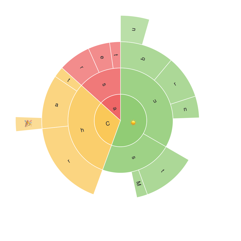
In the ever-evolving world of data visualization, traditional methods like bar graphs, pie charts, and line diagrams continue to hold steady ground. However, there is a newer form of chart that’s gaining momentum in recent years – the sunburst chart. As data sets become more complex and nuanced, the need for an aesthetically-pleasing yet robust visualization method becomes paramount. Sunburst charts, with their layered, radial complexity, are precisely the solution data analysts and visualization enthusiasts have been waiting for. This piece will dig into why sunburst charts are poised to be the future of data visualization, providing clarity and style where conventional methods may falter.
### 1. The Role of Complexity in Data Visualization
Data visualization has never merely been about presenting data; its purpose is to communicate insights effectively and engage the viewer. As datasets grow larger and more complex, the ability to distill these complexities and present them in a manner that’s as visually appealing as it is informative, becomes crucial. This is where sunburst charts shine.
Sunburst charts employ a radial layout to display hierarchical data, offering a clear visual representation of the parent-child relationship within the data categories. This layered structure allows intricate details to be presented without overwhelming the viewer, making complex relationships within the data easily discernible at a glance.
### 2. Clarity in Hierarchical Data Analysis
Imagine you’re trying to visualize the organizational structure of a multinational corporation, or the breakdown of a company’s expenditure across various departments and sub-departments. A sunburst chart can quickly reveal the financial spread and departmental hierarchy, allowing stakeholders to understand not just what’s going on, but also the breakdown within each section, making informed decisions a breeze.
### 3. The Aesthetic Factor
Design plays a significant role in the success of any data visualization. Sunburst charts, with their artful use of color, size, and shape, provide an engaging visual experience. They can be tailored to enhance the beauty of the data, making them especially appealing in creative industries like marketing or UX design, where visual appeal is crucial.
### 4. Versatility in Multiple Insights
Sunburst charts are not merely limited to showing a single hierarchy. They can visualize multiple layers, providing insights into not one, but several sets of related data simultaneously. This versatility makes them valuable tools for multi-faceted, complex datasets, such as understanding consumer behavior across different touchpoints in marketing analytics.
### 5. Efficient Space Utilization
Compared to traditional layout methods, sunburst charts make efficient use of space. This compact yet comprehensive approach allows for the presentation of nuanced data in a small area without resorting to clutter or sacrificing detail. It’s perfect for both print and digital formats, making it versatile for various presentation media.
### 6. Improved Reading Experience
The radial structure of sunburst charts enhances readability, offering a clear path for the viewer’s eye to move from the center of the chart outwards. This natural flow aids in quicker comprehension of relationships and trends.
### Conclusion
In conclusion, sunburst charts are the future of data visualization because they offer clarity, efficiency, and versatility in handling complex, hierarchical data. With their ability to provide insightful and engaging visualization without overwhelming the viewer, they are poised to disrupt traditional charting methods, becoming a fundamental tool in the data analyst’s arsenal. As data complexity increases, the demand for such visualization tools will continue to grow, cementing sunburst charts’ position as a premier choice in the visualization domain.
