Unleashing Insights: The Power and Possibilities of Sunburst Charts in Data Visualization
Data visualization has emerged as an essential tool for translating complex data into digestible insights, enabling stakeholders to understand patterns and take informed decisions. One lesser-known but highly effective type of visualization is the sunburst chart. This article delves into the nuances of sunburst charts, exploring their unique capabilities and how they can be utilized to unveil insights that might be overlooked through conventional charts.
### Definition and Basics of Sunburst Charts
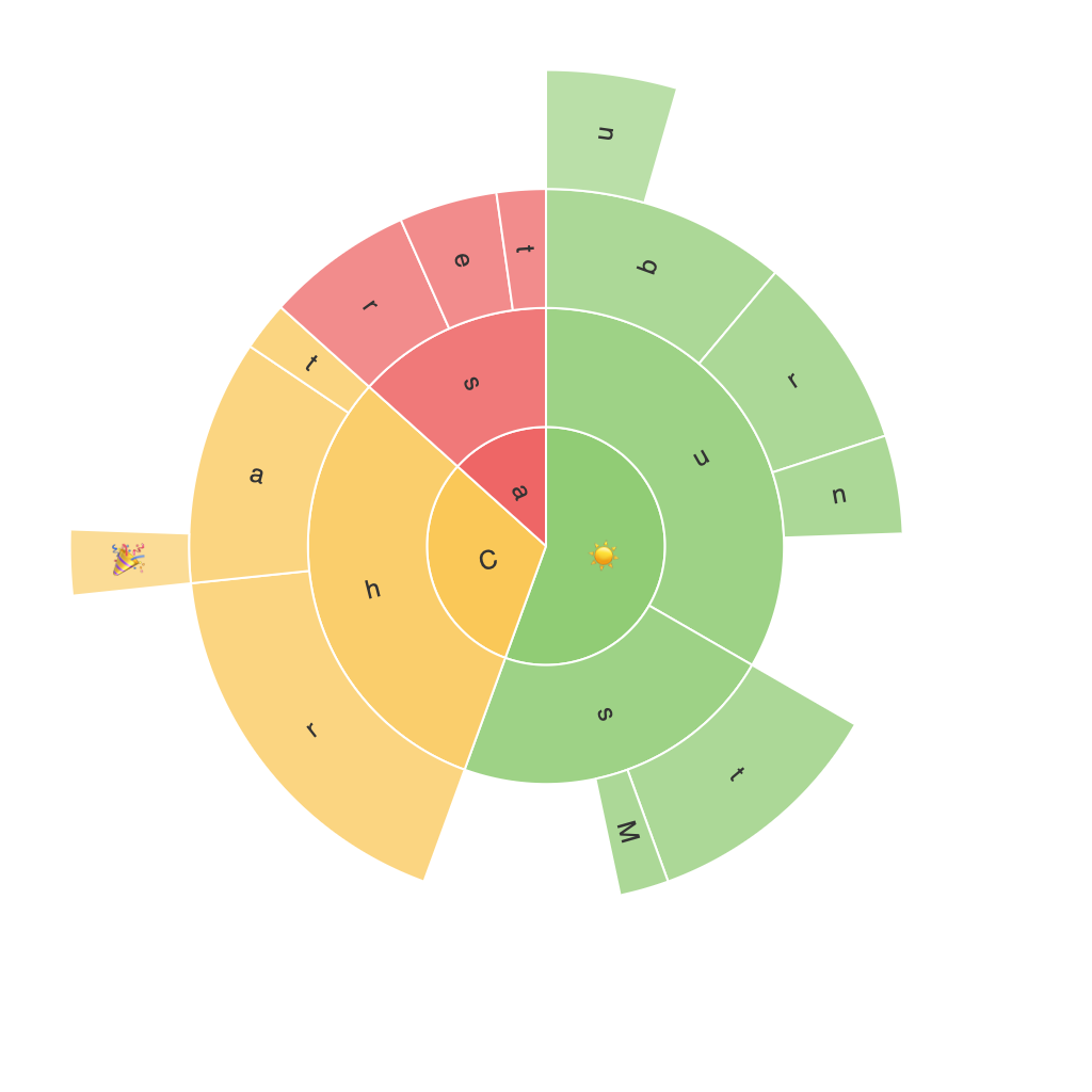
A sunburst chart is a hierarchical data visualization used to display a multilevel dataset. Unlike traditional tree maps and pie charts, sunburst charts offer a more organized and interpretable layout, providing a visual representation of hierarchical relationships and size differences within the dataset.
### Key Features and Customization Options
Sunburst charts distinguish themselves with these features:
– **Hierarchical Data Visualization**: They allow for the clear depiction of complex hierarchy data through layers, with the center representing the root node and outer layers representing subcategories.
– **Area Proportions**: The size of each sector (or segment) indicates the proportion of the whole, thereby showing the relative importance of different categories or sub-categories.
– **Anchored Labels**: Instead of numerical values, labels are typically anchored to the perimeter, providing context without cluttering the inner areas, which helps in distinguishing between different levels.
– **Color Coding**: Each level or sector can be assigned different colors, allowing for comparison not just in size but also in terms of categorical differentiation.
### Practical Applications
Sunburst charts are particularly powerful in various applications such as:
1. **Market Analysis**: Visualizing the market share among products, competitors, or segments, where each level can represent a higher category (market, region), and the branches represent the subcategories.
2. **Product Structure Analysis**: Breaking down the complexities of product categories, where the root node could represent the top-level product category and subsequent levels represent subcategories.
3. **Website Navigation Analysis**: Displaying the structure of a website’s navigation, showing the impact of different navigation paths on user engagement or conversion rate.
4. **Business Process Mapping**: Illustrating complex processes or workflows, where different layers could represent stages in a process, and sectors highlight the specific tasks or milestones.
### Customization for Enhanced Insights
Customizing sunburst charts effectively can lead to deeper insights by:
– **Modifying Sector Size**: Adjust the size of sectors to accurately represent proportions, aiding in quick comprehension of relative significance.
– **Utilizing Color Scales**: Implementing color gradients or patterns can draw attention to specific categories or trends, enhancing readability and interpretability.
– **Adding Tooltips**: Using tooltips to provide detailed information about each segment, allowing for interactive exploration and drilling down into more specific data points.
– **Interactive Features**: Enhancing user engagement through hover effects, clickable elements, or animations, which can provide additional insights dynamically as the user interacts with the chart.
### Final Thoughts
In conclusion, the power of the sunburst chart lies in its unique capability of visualizing hierarchical data comprehensively while emphasizing size and proportion. By utilizing these charts effectively, data analysts and business stakeholders can uncover insights and trends that might be missed with more conventional forms of data visualization. Whether in market analysis, product structure exploration, website navigation studies, or business process understanding, the sunburst chart emerges as a valuable tool, promising to enhance decision-making processes with its ability to transform data into actionable insights.
