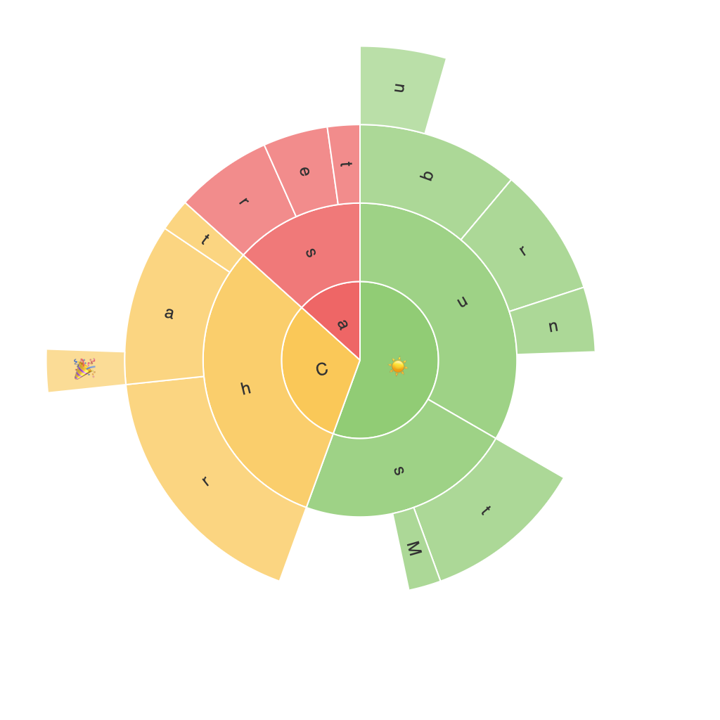
In the era of big data, an increasing number of professionals and enthusiasts have turned to data visualization as a powerful tool to help understand complex information more easily. Among the plethora of available visualization techniques, sunburst charts stand out as particularly effective in illuminating hierarchical structures with a visually stunning display.
Sunburst charts, also known as Ring charts or Multilevel Pie Charts, are circular diagrams composed of concentric rings, each one displaying a different level of the hierarchy. The outer-most ring generally represents the top-level categories, with each segment split into subsets, which are then further subdivided within subsequent rings. This layering allows for the hierarchical structure to be easily represented and accessed at different levels of detail, making it an invaluable tool in various sectors including web analytics, business intelligence, and domain reporting.
To better understand and utilize sunburst charts effectively in enhancing data interpretation, it’s essential to navigate through several concepts. Begin by identifying the components that make up a sunburst chart—the segments and arcs. Segments display the individual components or categories within the hierarchy, while arcs connect these segments and indicate the subset they belong to. The size of each segment is often proportional to the volume of data it represents, providing a clear visual representation of the relative importance of each category at different hierarchical levels.
Moreover, implementing colors and annotations can significantly boost the chart’s interpretability. Choosing distinct colors for each segment enables easy differentiation between categories, while annotations can be used to specify the values or percentage contributions of each segment, aiding in direct understanding. Additionally, labels outside the chart, known as a legend, provide further context and can guide users through the levels of the hierarchy more intuitively.
Effective implementation of sunburst charts also requires careful consideration of the data to be visualized. The hierarchy should be well-defined and meaningful, ensuring that the chart directly aids in uncovering insights rather than complicating them. Furthermore, striking a balance between the depth of the hierarchy and the number of levels is crucial; adding too many levels or too many data points in the segments can compromise readability and distract from the primary insights.
To ensure the sunburst chart’s effectiveness, there are a few best practices to consider. Firstly, maintain a consistent scale for the segments in similar rings to facilitate comparison. Secondly, avoid overly complex hierarchies; instead, opting for simpler structures ensures that the main insights are easily accessible without requiring a deep understanding of the data’s intricacies. Lastly, consider user interaction if creating digital visualizations. Interactive sunburst charts allow users to explore the data at different levels dynamically, enhancing the experience through exploration and interaction.
In conclusion, the visual power of sunburst charts lies in its ability to represent hierarchical data in a visually engaging and accessible manner. Whether examining website traffic, monitoring financial structures, or analyzing organizational hierarchies, sunburst charts offer a compelling and effective visualization tool. Following the outlined principles of implementation, a well-designed sunburst chart not only captures user attention but facilitates deeper insights and better decision-making.
