### Visual Insight: Mastering the Sunburst Chart for Effective Data Representation
#### Introduction
In the vast landscape of data visualization, various tools and techniques offer unique ways to interpret and communicate complex data sets. Among these, the sunburst chart emerges as a powerful method to represent hierarchical data in a visually intuitive manner. This article delves into the intricacies of the sunburst chart, exploring its design principles, applications, and best practices for constructing effective visual representations.
#### Understanding the Sunburst Chart
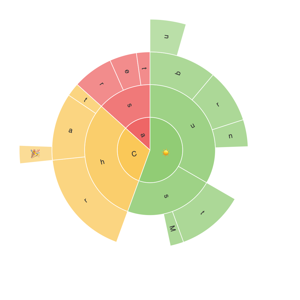
The sunburst chart is a radial hierarchical chart that uses concentric rings to depict various levels of a hierarchical dataset. Each level of hierarchy is represented by a new ring, with the innermost ring typically depicting the highest level of the hierarchy. This structure allows viewers to easily discern the relationships and proportions between different categories within a dataset. The chart is akin to a modified treemap, but with an added dimension of radii instead of rectangles, providing a more space-efficient layout.
#### Key Characteristics
1. **Radial Layout**: The most distinctive feature of the sunburst chart is its radial layout, which arranges data categories around a center. This layout helps in visualizing the hierarchical structure in a compact space, making it suitable for datasets with a high degree of hierarchy.
2. **Color Usage**: Colors are crucial in distinguishing between different categories and subcategories. They help in highlighting important segments and make the chart more engaging and easier to understand.
3. **Link Length and Transparency (Size)**: The link length between sectors can be proportional to the value of the category, which visually communicates the size of the category. Transparency (size) of the sectors can also indicate the depth in the hierarchy, providing a second layer of information regarding the structure of the data.
4. **Navigation and Exploration**: Sunburst charts can be navigated through zooming into rings for further detail, allowing users to drill down into specific categories without losing the overall context.
#### Applications in Data Representation
Sunburst charts are particularly useful in scenarios where hierarchical data needs to be clearly visualized, such as:
– **Organization Structures**: Displaying the structure of an organization or company, indicating the relationships between departments and sub-departments.
– **Product Line Analysis**: In retail or manufacturing, to view and compare the various categories and subcategories within a product line.
– **Project Management**: Showcasing the breakdown of tasks and their relationships within a project, emphasizing the division of labor and responsibilities.
– **Web Analytics**: Visualizing site navigation patterns, focusing on the main sections and their sub-elements.
#### Best Practices
Creating effective and meaningful sunburst charts involves several considerations to ensure clarity and ease of understanding:
– **Data Hierarchy Clarity**: Ensure the hierarchy is well-defined and clearly communicated. Use labels and tooltips effectively to support the hierarchical layout.
– **Choose the Right Layout**: Depending on the dataset size, choose a layout that maximizes data readability without compromising on space. For large datasets, consider limiting the number of subcategories displayed per category to avoid clutter.
– **Color Scheme**: Develop a consistent and meaningful color scheme that highlights different categories. Ensure color contrasts are sufficient to accommodate color blindness.
– **Focus on Key Metrics**: Emphasize the most important data points by using contrasting colors, increasing size, or adding annotations. This directs the viewer’s attention efficiently.
– **Interactive Elements**: Implement interactive features such as tooltips, hover effects, or clickable labels to enhance user engagement and facilitate deeper data exploration.
#### Conclusion
The sunburst chart represents a powerful and elegant tool for data representation, particularly in conveying hierarchical data with ease and readability. Its unique radial layout and various customization possibilities make it adaptable to a range of complex datasets. By adhering to best practices in design and data visualization, professionals can effectively use the sunburst chart to illuminate hidden patterns, relationships, and trends within data, enhancing decisions-making processes across various industries.
