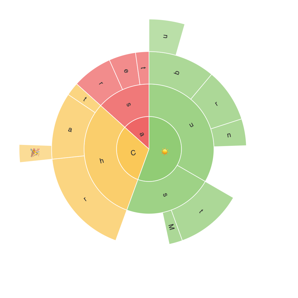
Unleashing the Power of Data Visualization: An In-Depth Guide to Creating Compelling Sunburst Charts
Introduction
In today’s data-driven world, the ability to understand and present complex datasets in a comprehensible and visually appealing way is more critical than ever. One such visualization tool that stands out amidst an array of graphic presentation techniques is the sunburst chart or sun chart. With its hierarchical structure and visually engaging design, the sunburst chart enables the viewer to quickly grasp intricate data relationships. In this guide, we’ll delve into the specifics of creating compelling sunburst charts and unravel their immense potential in uncovering hidden trends and insights.
Understanding the Sunburst Chart
The sunburst chart, also known as a radial tree or multi-level pie chart, represents hierarchical data as alternating segments of rings (circles in concentric sizes). This unique configuration allows viewers to perceive patterns that would be difficult, if not impossible, to detect with standard charts such as bar graphs or pie charts.
Creating a Sunburst Chart
To create an effective sunburst chart, follow these steps:
1. **Identify Hierarchical Data**: Choose a dataset that contains a nested structure, making it ideal for representation through a sunburst chart. This could range from website navigation patterns, product categories, or even organizational structures.
2. **Select Your Tool**: There are several tools available that can handle the creation of sunburst charts, including Tableau, Power BI, Google Charts, and Datawrapper, among others. Each tool has its own set of features and customization options, so tailor your choice based on your specific needs and skill level.
3. **Data Preparation**: Arrange your data in a tabular format that clearly delineates the hierarchical layers. Typically, this involves columns detailing categories at each level of the hierarchy.
4. **Generating the Chart**: Import your dataset into your chosen tool and use its integrated features to generate a sunburst chart. Most tools feature a user-friendly interface allowing you to easily adjust the layout, colors, labels, and other visual aesthetics of your chart.
5. **Customization and Refinement**: Enhance your sunburst chart by adding color gradients to segments, adding labels with tooltips, or including a summary at the center to summarize the data. These refinements can significantly improve the readability and impact of your chart.
6. **Effective Labeling**: To avoid clutter, carefully select which data points to label. Utilize tooltips for detailed information when hovering over segments, which can display values or any associated metadata.
7. **Exploration and Interaction**: Tools like Tableau and Power BI offer advanced features such as dynamic data filtering and interactive elements. These features allow users to explore your data visually and deepen their understanding of the dataset.
Key Considerations for Effective Sunburst Charts
**Visualization Clarity**: A well-constructed sunburst chart should prioritize clarity and simplicity, avoiding excessive complexity that could obscure the hierarchy or key insights. Maintain a clean design, use appropriate color contrasts, and balance segment sizes for an immediate impact.
**User Accessibility**: Ensure that the chart is easily understandable by your target audience. Use understandable categories, clear labeling, and visual cues like color and size that align with user expectations.
**Insight Discovery**: Use sunburst charts specifically to spot hierarchical patterns, find dominating segments, or explore the correlations across different levels. They are powerful for data exploration, as they encourage users to look for trends in the relationships between data points.
**Integration and Reporting**: Incorporate sunburst charts into reports, dashboards, or presentations to enhance the effectiveness of your data communication. They can help communicate complex data relationships succinctly and highlight significant findings that support a narrative.
Conclusion
Sunburst charts represent an advanced method of data visualization, offering a unique lens to interpret hierarchical data and uncover patterns that might be overlooked in flat or less structured presentations. By carefully constructing these charts and leveraging their inherent visual strengths, users can communicate key insights with clarity and impact. Whether utilized in professional reporting, educational settings, or data analysis, the sunburst chart stands as a tool capable of transforming data into memorable, actionable knowledge.
As you navigate the realm of data visualization tools and techniques, consider integrating the capabilities of sunburst charts to enrich your visual storytelling and improve the depth of your data-driven insights.
