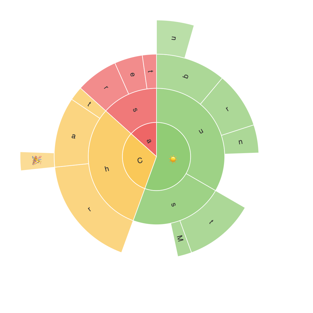
Decoding the Sunburst Chart: A Comprehensive Guide to Data Visualization and Business Insights
Sunburst charts, a sophisticated and visually striking form of data visualization, have emerged as a powerful tool in the realm of business intelligence and performance analysis. Unlike traditional pie charts or treemaps, sunburst charts offer a unique approach to hierarchical data representation, providing deeper insights and enhanced clarity in the interpretation of complex data sets. This comprehensive guide aims to demystify the intricacies of sunburst charts, revealing their application in the critical area of business insights, thus empowering data analysts and business leaders alike.
Understanding the Basics of Sunburst Charts
Before we delve into the applications and nuances of sunburst charts, let us first understand their fundamental structure and how they differ from traditional pie charts. Sunburst charts, also known as ring charts or sun charts, display hierarchical data in layers or disks radiating out from the center. Each disk represents a hierarchical level, with child categories spreading out from parent categories, allowing for a visual hierarchy that breaks down data into meaningful segments.
Key Components of a Sunburst Chart
1. **Center Node**: Represents the overall total or the root of the hierarchy. The size of the central node could symbolize the total value of the entire dataset.
2. **Root Categories**: These are the primary categories that form the base of the sunburst. They typically represent the main divisions or categories within your data, such as different departments in a company.
3. **Child Categories**: These are the subcategories or deeper levels in the hierarchy. In the context of business data, these might correspond to individual employees, projects, or strategies within departments.
4. **Sectors and Leaves**: Each segment within a disk (except the root node) represents a specific subcategory or leaf node. Its position, or radial length, often signifies relative size or importance.
5. **Color Coding**: Used to distinguish different categories and to further classify or highlight specific subsets of data. The color scheme can be consistent or divergent, depending on the preferences and objectives of the chart.
Applications of Sunburst Charts in Business
1. **Product Hierarchy**: Sunburst charts excel in visualizing product categories and subcategories. For instance, a retailer might use a sunburst chart to break down sales data by department, category, and specific product lines.
2. **Sales Forecasting and Analysis**: By layering sales data across different segments (such as product lines, sales territories, or time periods), businesses can identify trends, opportunities, and potential areas for growth.
3. **Marketing Strategy Analysis**: Sunburst charts can help marketers analyze campaign ROI by layering data through customer segments, channels, campaign types, and outcomes, providing a clear picture of the most effective strategies.
4. **Employee Performance and Development**: In human resources, sunburst charts can be used to analyze employee performance across departments, roles, or geographical areas, highlighting strengths, weaknesses, and potential areas for training.
5. **Operational Efficiency**: For operational analytics, sunburst charts can map out process hierarchies, identifying bottlenecks or efficient workflows through the visualization of stages, resources, and outcomes.
Best Practices for Effective Sunburst Chart Visualization
– **Clarity and Focus**: Ensure the chart is not overly complex. Limit the number of leaf categories to maintain readability and focus on the most critical areas of the data.
– **Consistent Colors and Legends**: Use a consistent color scheme and include a legend to aid in the interpretation of categories.
– **Semi-Automatic Level Cutting**: Exclude less significant categories to keep the chart clear and relevant. Tools like TreeFlow can be particularly helpful in automatically cutting the levels based on relevance, removing irrelevant categories from the visualization.
– **Interactive Elements**: Implement hover effects that show detailed values and perhaps even connections to a pie or bar chart for direct comparison or deeper analysis.
– **Accessibility and Aesthetics**: Pay attention to color contrast, font sizes, and chart layout to ensure the chart is not only visually appealing but accessible to all viewers, including those with visual impairments.
Conclusion
In conclusion, sunburst charts are an invaluable tool for businesses seeking to extract deeper insights from their hierarchical data. By leveraging this visualization technique, companies can uncover trends, prioritize strategies, and optimize operations more effectively. With a thorough understanding of its components and best practices, data analysts and decision-makers can harness the true potential of sunburst charts to transform their data into actionable intelligence.
