Title: Decoding the Sunburst Chart: A Dynamic Approach to Visualizing Hierarchical Data with Clarity and Precision
Introduction
Sunburst charts offer a visually engaging, dynamic solution for the representation of hierarchical data, making complex information easily comprehensible. The unique design of sunburst diagrams facilitates efficient data processing and analysis compared to traditional visualization methods. This article delves into the intricacies of sunburst charts, their construction, and the benefits they provide in unraveling the nuances of hierarchical data structures.
Construction and Representation
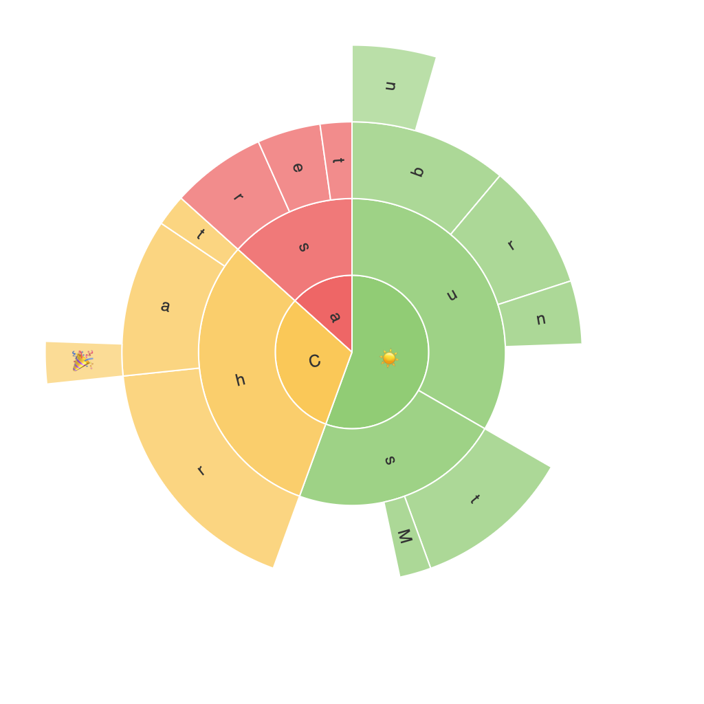
Sunburst charts feature concentric circles, with each level of hierarchy represented by a distinct sector. The radial center of the chart corresponds to the root node of the hierarchy, while each following concentric circle represents a level in the hierarchy. Anomalies and significant variations in data can be easily identified through color coding, varying the hue of each sector to visually represent different attributes or value ranges.
Enhancing Data Complexity Management
Sunburst charts excel in managing high data complexities by providing a clear, visual hierarchy representation that enables users to intuitively understand the scale and volume of data. This visualization style allows for the rapid identification of patterns, trends, and outliers, making it well-suited for large datasets and intricate hierarchical structures.
Improved Comparisons and Insights
By structuring data in a radial format, sunburst charts facilitate easier comparisons across different categories. Users are better equipped to grasp relationships, dependencies, and dependencies within the hierarchy, which can be challenging to discern using conventional charts. This structure also aids in highlighting patterns, overlaps, and connections that might not be as evident in tabular or linear data representations.
Interactivity and Accessibility
Sunburst charts can be highly interactive, allowing users to drill down and explore various levels of the hierarchy with ease. The intuitive navigation through the chart provides a dynamic user experience, reinforcing understanding of the hierarchical relationships. This interactive feature maximizes the accessibility of complex data, enabling users to customize their exploration based on their preferences and specific analysis requirements.
Optimization for Limited Space
Employing sunburst charts as an alternative to horizontal or vertical bar charts can optimize the use of available space in reports, presentations, or dashboards. Despite their compact nature, sunburst charts maintain the clarity and precision of data representation, ensuring that the visual hierarchy remains easily understood, even in confined spaces.
Conclusion
Sunburst charts represent a powerful and dynamic tool for the visualization of hierarchical data with unparalleled clarity and precision. Their unique design facilitates efficient data processing, analysis, and comparison, even in the face of complexity and volume. By enhancing the user’s ability to identify patterns, trends, and connections within the data, sunburst charts provide a more intuitive and accessible visualization solution, suitable for various professional and personal data exploration needs.
Incorporating sunburst charts into your analytical toolkit equips you with an invaluable asset for turning data complexity into comprehension, making them indispensable in the realm of data visualization and analysis.
