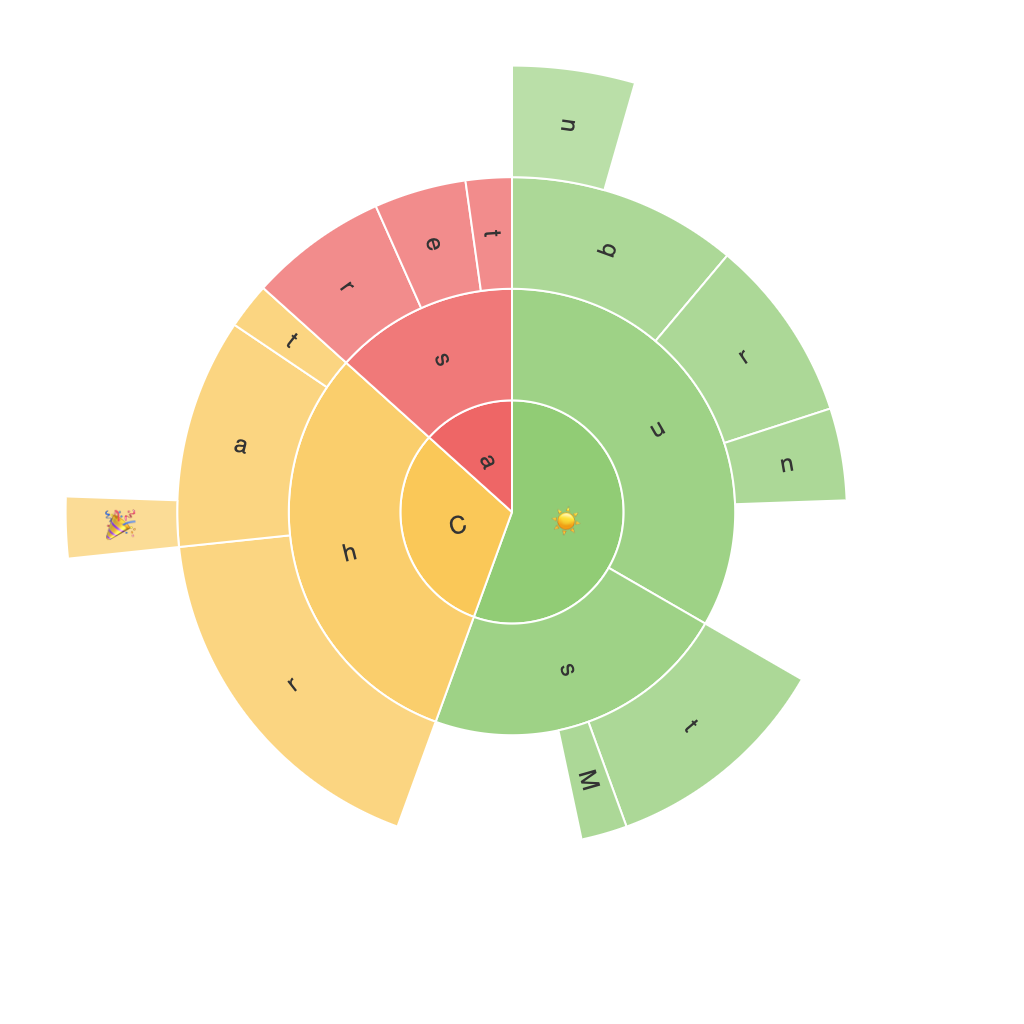
Creating and Interpreting Sunburst Charts: Simplifying Complexity
Sunburst charts, a subset of radial treemaps, offer a visually rich, yet accessible way to visualize hierarchical data with complex relationships. Unlike traditional pie charts, sunburst charts scale from the whole to its constituent parts across multiple levels, making it particularly useful for displaying deeper hierarchical structures. This article aims to demystify the intricacies involved in creating and interpreting sunburst charts, highlighting their unique benefits in representing complex datasets clearly and elegantly.
### Step 1: Understanding the Structure
A sunburst chart is built around a central circle, with each subsequent ring extending radially outward, representing different levels of the hierarchy. The radial segments each represent a category within the hierarchy, while the size of each segment is proportional to either the value it represents, or its percentage of the whole depending on the chart’s setup. Each ring represents a deeper level of the hierarchy, allowing for the visualization of multiple levels of relationships in a single view.
### Step 2: Creating Sunburst Charts
To create a sunburst chart, several software tools and programming languages offer libraries and functions designed specifically for this type of visualization.
**Software Tools:**
– **Tableau:** Provides a drag-and-drop interface to create sunburst charts directly from your data.
– **Power BI:** Another powerful tool where you can build custom visuals including sunburst charts through its rich set of features.
**Programming Libraries:**
– **Python’s Matplotlib:** While Matplotlib is primarily used for most types of charts, it lacks a dedicated function for sunburst charts. However, a workaround involves utilizing external libraries such as `holoviews` or `squarify` for specific aspects of the chart creation process.
– **R:** Packages like `ggplot2` or `scales` offer versatility in creating complex visualizations, and the community has contributed functions for creating sunburst charts (e.g., `scales::sunburst`).
### Step 3: Enhancing the Interpretability of Sunburst Charts
To effectively convey your intended message, several design choices must be made carefully:
– **Color Schemes:** Use distinct and accessible color palettes to visually discriminate different segments. Utilize neutral colors for base levels of the hierarchy, and slightly saturate colors to highlight more critical subcategories.
– **Labeling:** Ensure clear, succinct label placement that does not clutter the chart. Utilize tooltips to explain more complex data points, which becomes especially important when dealing with detailed hierarchical information.
– **Accessibility:** Maintain text readability and color contrast to ensure that your chart remains understandable for all viewers, including those with visual impairments.
### Step 4: Interpreting Sunburst Charts
The most effective interpretation of a sunburst chart involves understanding the radial and concentric relationships:
– **Radial Structure:** Starting from the center and moving outward helps in visualizing the hierarchical structure. Each ring provides additional layers of detail.
– **Concentric Comparison:** Similar-sized segments in adjacent rings indicate either identical values (across levels) or potentially comparable levels of diversity within an expanded hierarchy.
– **Proportional Size:** The size of each segment clearly indicates the relative importance or size of each category within its level and its parent level.
### Conclusion
Unveiling the complexities through a well-structured and beautifully designed sunburst chart transforms otherwise overwhelming, hierarchical data into easily digestible insights. Whether for business intelligence, academic research, or general information presentation, these charts offer a unique perspective that enhances comprehension and engagement with complex datasets.
Adopting the practical guidelines for creation and interpretation detailed earlier will not only lead to the production of sophisticated visualizations but also facilitate clearer, more effective communication of information across various fields.
