Title: Decoding the Sunburst Chart: A Comprehensive Guide to Understanding and Utilizing This Versatile Visualization Tool in Data Analysis
Introduction:
Sunburst charts, also known as ring charts or multi-level sun charts, are a popular and visually striking alternative to tree maps and pie charts in data visualization. These types of charts serve as valuable tools for data analysts seeking to simplify complex hierarchical data, providing clarity in organization structures, product category sales, or project breakdowns. Their versatility and visual prominence can elevate data storytelling to a more engaging and informative experience. This article aims to provide a comprehensive guide on understanding and utilizing sunburst charts in data analysis.
Understanding Sunburst Charts:
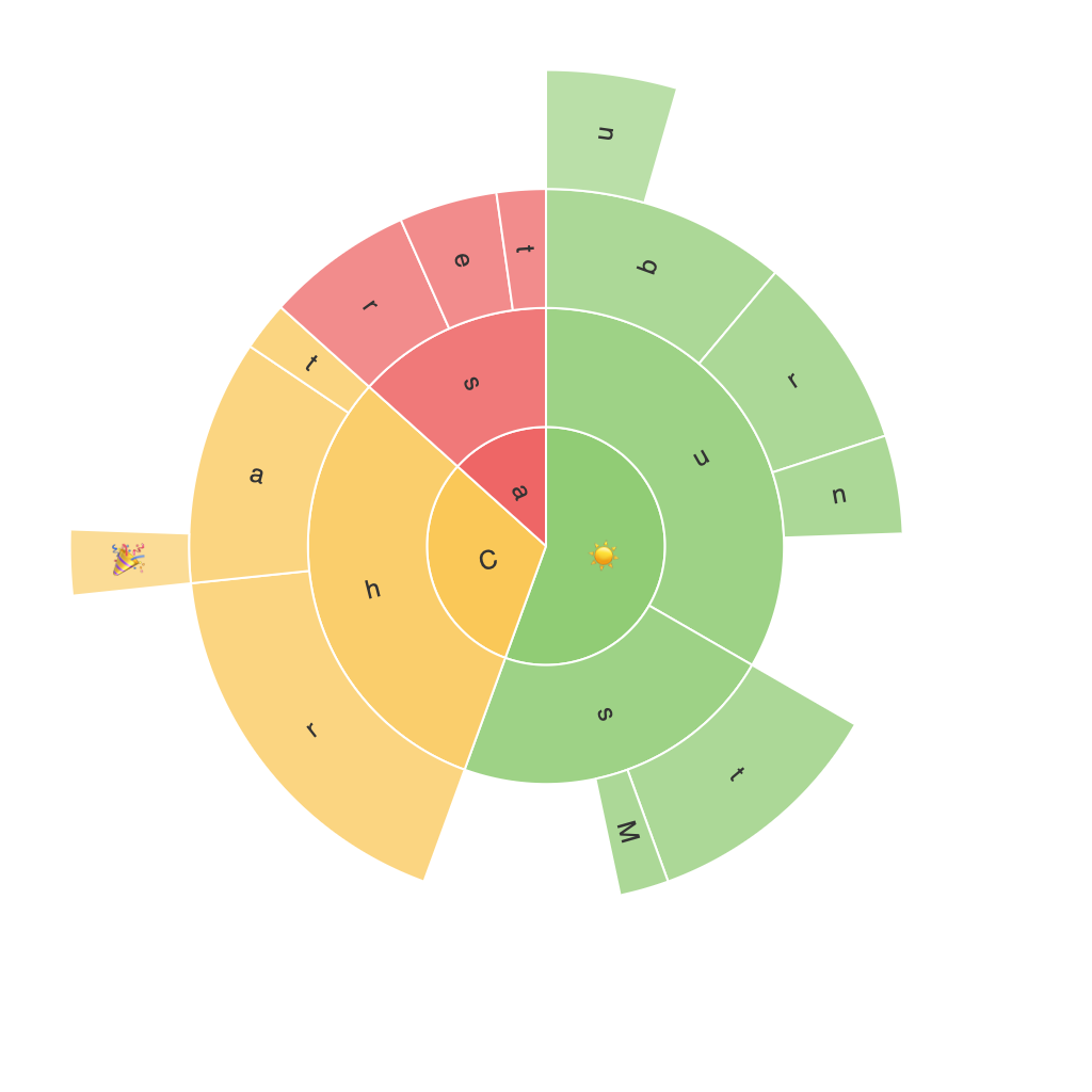
A sunburst chart displays data across concentric circles, with each circle representing a higher level of the hierarchy. The main circle represents the first level, expanding to further circles for higher-level categories. Radii are proportional to the parent/child category’s size and sectors are proportional to the child subcategory’s associated value. This multidimensional visualization allows for the presentation of hierarchical data clearly and comprehensively.
Advantages of Sunburst Charts:
1. Effective Hierarchy Visualization: Sunburst charts are ideally suited for displaying hierarchical data, clearly showing the structure, size, and relationships between different levels and categories.
2. Space Efficiency: When visualizing large datasets or high levels of hierarchy, sunburst charts can provide a more compact representation than traditional charts, enabling efficient space utilization on screens or printed material.
3. Enhanced Data Interpretation: By arranging categories radially, users can easily discern high-level trends and patterns, as well as make comparisons between categories at different levels.
4. Customization: Sunburst charts are highly customizable, making them adaptable to a wide range of data sets and aesthetics. From sector colors to text labels, various adjustments can be made to enhance readability and visual impact.
5. Improved User Engagement: The vibrant, dynamic layout of sunburst charts makes data more engaging and memorable, particularly for storytelling about complex data structures.
Applications of Sunburst Charts:
1. Organization Structure Analysis: Businesses can use sunburst charts to visualize their organizational structure, helping personnel understand the company’s hierarchy and department relationships.
2. Product Line Analysis: Retail and manufacturing industries can benefit from utilizing sunburst charts to show their product category sales or inventory, breaking it down into subcategories for easier analysis.
3. Project Breakdown Visualization: For project management purposes, sunburst charts can represent milestone completion or project breakdowns, revealing critical insights into resource allocation and progress.
4. Financial Data Analysis: Financial institutions can use sunburst charts to show financial data such as budget allocation, investment portfolio diversification, or income sources, highlighting trends within different sectors.
Considerations for Effective Utilization:
1. Complexity Management: Using too many levels or categories can lead to overcrowding and obfuscation in the visual representation. It’s important to maintain balance in the chart’s hierarchical structure.
2. Data Aggregation: Aggregating too much data at certain levels can make it difficult to discern specific details within the chart. Strategically choosing the right granularity is essential for effective data visualization.
3. Aesthetic Choices: Selecting colors, fonts, and labels thoughtfully can improve readability and the overall visual impact of the sunburst chart, aiding in effectively communicating the data story.
Conclusion:
Sunburst charts offer a powerful and visually appealing tool for presenting hierarchical data in data analysis. Their clear depiction of relationships, efficient space utilization, and enhanced interpretation features make them a valuable asset for anyone seeking to visualize and present complex data in an engaging manner. With careful consideration of complexity, data aggregation, and visual elements, analysts can construct informative and impactful sunburst charts tailored to their specific data analysis needs.
