Exploring the Visual Power of Sunburst Charts: Understanding Complex Data Relationships in a Glance
Sunburst charts are a form of data visualization used to represent hierarchical data in a visually appealing format. Unlike traditional pie charts, which only represent a single level of relationships among categories, sunburst charts provide an expanded view, allowing for a detailed exploration of complex data relationships and structures.
Understanding complex data relationships is crucial in various fields such as business intelligence, economics, and even everyday marketing analyses. Sunburst charts offer a convenient solution for interpreting intricate datasets by dividing them into segments, radiating them in concentric circles, thus simplifying understanding through visualization.
The Structure of Sunburst Charts
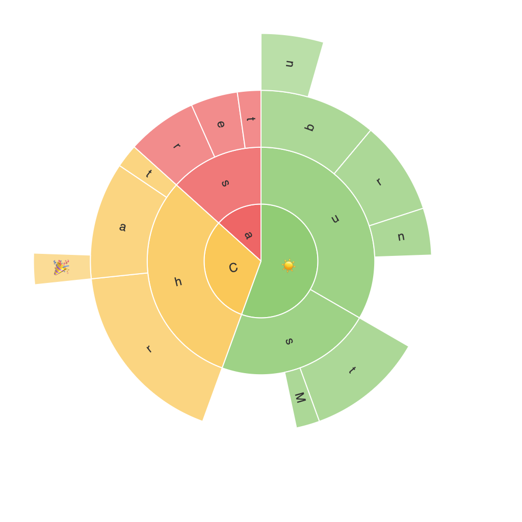
Sunburst charts are built with a central anchor, typically representing the root of the hierarchy, which radiates outwards to sectors in concentric circles. The sectors are divided into segments that correspond to child nodes, and these also radiate outwards, representing further subdivisions of data. Each outer layer represents a new level in the hierarchy, allowing for a multi-dimensional analysis of the data based on nested categories or subcategories.
Graphical Elements and Interpretation
Each sector of a sunburst chart represents a node in the hierarchy, providing quick access to a range of information with minimal clutter. The color of each sector usually corresponds to a specific classification, category, or variable, aiding in clear differentiation and highlighting key points. Moreover, the size and angles of the segments offer further insights – larger segments represent a higher frequency or value within the data, while the arrangement of sectors provides a visual comparison between various levels of the hierarchy.
Benefits of Sunburst Charts
1. **Scalability**: Sunburst charts can handle hierarchical data on a large scale without sacrificing readability. This scalability makes them suitable for datasets of any size with multiple levels of hierarchy.
2. **Compact Space**: These charts are designed to make efficient use of space, making them ideal for both print and digital formats where space is often at a premium.
3. **Multidimensional Insights**: Users can easily distinguish between different categories and subcategories at different levels of the hierarchy. This provides a comprehensive view of how data is distributed throughout the structure.
4. **Accessibility**: The visual representation makes it easier for people with diverse technical backgrounds – including those without extensive data analysis skills – to understand and interpret complex information.
5. **Comparison**: Sunburst charts enable quick comparisons between various hierarchical levels and categories, which is particularly useful for spotting trends and identifying anomalies within the data structure.
Practical Applications
Sunburst charts find application in various industries:
– **Business Intelligence and Analytics**: To visualize company structures, product portfolio analysis, revenue distribution, and organizational hierarchies.
– **Marketing and Sales**: Analysis of customer segments, product categories, sales distribution, or market share breakdown.
– **Financial Services**: Portfolio analysis, risk assessment, or investment hierarchies.
– **Economics and Research**: Hierarchical data representation across economic sectors, geographical areas, or time periods.
Limitations
While sunburst charts excel in visualizing hierarchical data, there are limitations to consider:
– **Data Density**: Large numbers of categories at each level can make it difficult to distinguish between segments, leading to interpretational challenges and potential data overload.
– **Complex Interactions**: As the number of levels increases, understanding the relationship between the inner and outer layers becomes more complex, requiring additional context for interpretation.
– **Limited to Hierarchy**: These charts are well-suited for certain types of hierarchical data, but they may not be as effective for non-hierarchical datasets or for displaying correlations between variables.
Conclusion
In conclusion, the visual power of sunburst charts lies in their ability to clearly present complex hierarchical data structures in an array of concentric rings. By using segments of varying colors and sizes, these charts provide an accessible, comprehensive, and multidimensional interpretation of large datasets. Their unique structure and capabilities make them indispensable tools in fields where hierarchical relationships are fundamental, facilitating better understanding and decision-making.
