Exploring the Visual Power of Sunburst Charts: Enhancing Data Understanding and Presentation
Sunburst charts, a visually-rich and information-packed form of radial tree diagrams, have emerged as powerful tools for data visualization. This article delves into the world of sunburst charts, exploring their visual impact, how they effectively enhance data understanding, and the unique presentation opportunities they offer.
### Visual Appeal and Clarity
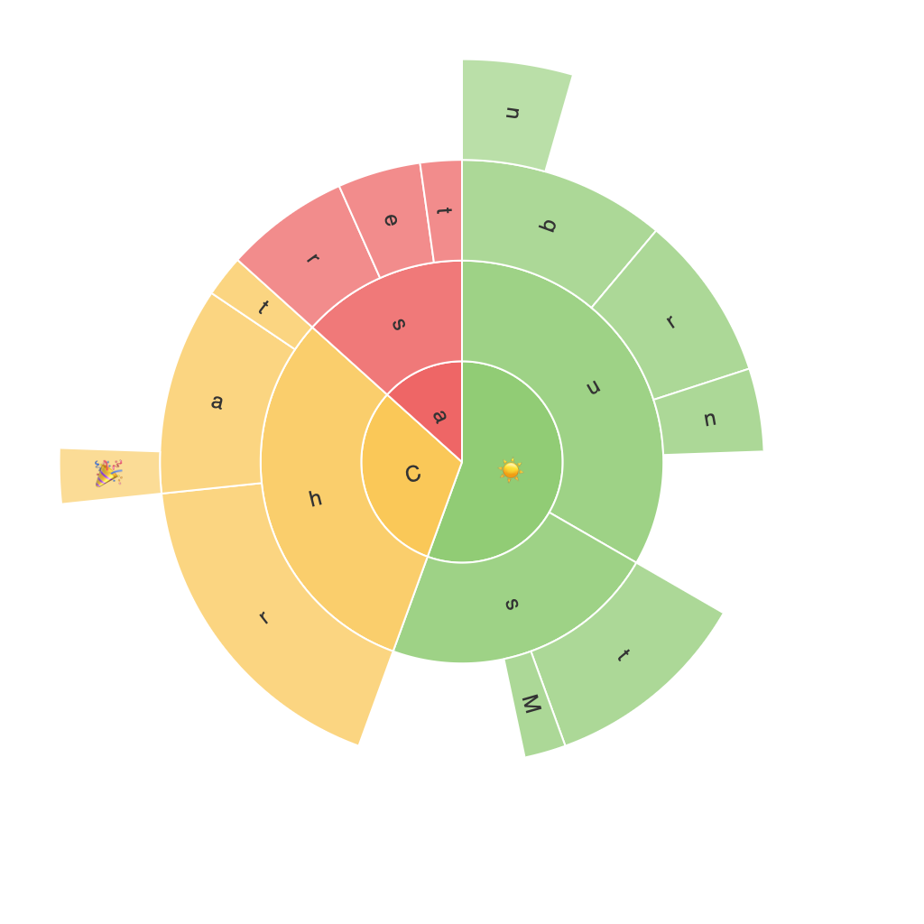
Sunburst charts stand out due to their visually appealing design, which makes complex hierarchical data more accessible and easier to comprehend. The chart displays data in a radial format, with concentric circles representing different levels of data hierarchy. Each segment or slice, colored differently, signifies a data category, allowing for an immediate understanding of the dataset’s structure and composition.
### Facilitating Data Exploration
One of the compelling benefits of sunburst charts is their ability to facilitate data exploration. Users can analyze the dataset layer by layer, from the top-level categories down to specific subcategories. This hierarchical structure enables a detailed dive into data without overwhelming the viewer with too much information at once. The chart’s visual layout encourages users to identify patterns, connections, and distributions within the data more intuitively compared to linear or tabular representations.
### Comparative Analysis
Sunburst charts are particularly adept at facilitating comparative analysis. The size of each segment, or its position relative to others, visually represents the magnitude of each category or subcategory. This makes it easy to compare different segments and understand their relative importance within the whole. Moreover, tooltips and interactive functionalities (if supported) allow users to quickly access detailed data for any segment with simple mouse movements, enhancing user engagement and analysis depth.
### Enhancing Presentation and Communication
In terms of data presentation and communication, sunburst charts are highly effective in illustrating complex datasets in a straightforward yet visually engaging manner. They can be particularly useful in presentations and reports where clarity and impact are essential. By leveraging color, size, and radial layout, sunburst charts can quickly convey a story or highlight key insights, making them an excellent choice for engaging audiences, especially in contexts where a comprehensive understanding of data hierarchies is beneficial.
### Limitations and Best Practices
While sunburst charts offer a wealth of visual power, they are not without limitations. The complexity of data interpretation might increase when dealing with deep, multilevel hierarchies, making the chart harder to read than simpler visualizations. Additionally, maintaining readability can be challenging with an excessive number of categories. Best practices in designing sunburst charts include keeping the number of categories manageable, using consistent color themes, and providing clear labels where necessary.
### Conclusion
Sunburst charts offer a compelling visual approach to presenting hierarchical data in a way that enhances understanding and engagement. Their radial design, comparative analysis capabilities, and ability to make complex data accessible make them invaluable tools in data visualization. Incorporating best practices can further enhance their effectiveness in conveying data insights and supporting decision-making processes. Whether in academic, corporate, or any analytical environments, sunburst charts prove to be a valuable addition to the data visualization toolkit.
